Website Accessibility Techniques for A Great User Experience
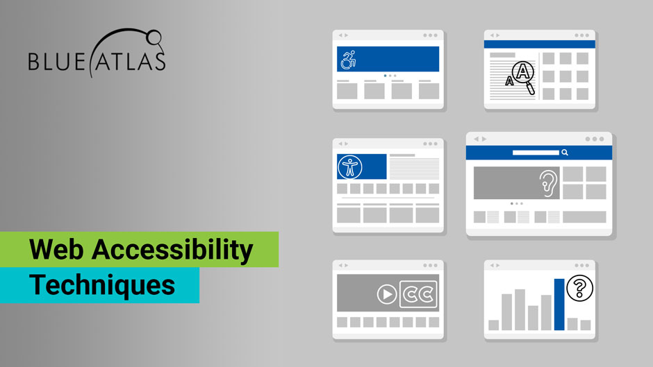
When talking about website accessibility, it’s easy to reference the WCAG 2.1 (Web Content Accessibility Guidelines) or the ADA (Americans with Disabilities Act). But businesses with sites of their own are generally interested in more specifics – what exactly do these guidelines mean for their current sites? What are examples of changes made to help individuals with disabilities?
One of the best places to start with this process is a full accessibility audit for compliance, which we are happy to help with. However, this guide will drill down into more specific examples of web accessibility techniques, and why these particular practices are useful. These types of examples can also work well when creating internal employee handbooks for content creation and web publishing practices!

Specific Websites Accessibility Techniques to Reference
First, we know that explaining examples is great for detail, but many businesses would also like to see real-world websites that live up to these accessibility steps. Not every website does things perfectly, but some major sites perform well. This list has a collection of great examples of accessible websites, and here is another list of the top 10 ADA Compliant Websites.
We’ll also reference a few specific examples in some of our points below. If there’s a point that seems confusing, always ask for a website example so you can see how it performs in action.
Clear Website Structure and Design
Website accessibility depends on a solid foundation for a website. That means starting with web accessibility development best practices: A clear, logical design that’s easy to understand, both for the UI and the backend. While no specific types of code or script are required for website accessibility (although some are advised), the website code should generally be easy to understand and alter as time goes on. This often means staying away from cookie-cutter web layouts that don’t encourage enough customization.
Plenty of other website best practices apply here, too. Clear, easy-to-follow home pages without clutter are an important starting place. Well-organized menus and navigation tools are another necessary step. Avoiding problems like walls of text or annoying pop-up ads that obscure website tools are also necessary. Mastering these basics won’t just help make your site ready for accessibility but will also make it more usable for all leads. Now, we can examine more specifics.
Proper Alt Tags for Images
Alt tags are an extra line of text added to an image’s metadata that directly describes the image. This allows screen readers to quickly read out that description for individuals who may not be able to see what the image is. Important alt-tag practices include:
- End the description with a period, even if it’s not a complete sentence. This helps screen readers understand the text.
- Descriptions should not use words like “image” or “picture.”
- Descriptions should be short and concise, so they don’t waste time.
It can sometimes be difficult to see if an image has alt text just by looking at it online. Alt text is often hidden from view until read by screen readers, although some sites choose to add a display option when the cursor is hovering over an image. Fortunately, alt text is usually very easy to add even if your current web images don’t use it. No extra tools are needed.
Sequential Headers
Sequential headers should follow a logical header structure that makes sense and is very easy to read. When one heading is an H2 header, all similar headings should be as well, with H3, etc. Headers should not simply be bolded or centered: The header tags are necessary for proper navigation and screen readers. Look at Hilton’s guide to Paris for a good example of well-assigned headers, subheadings, and text in a logical order.
Text Clarity
Text should be well-sized and spaced, and always available in a clear font. When possible, text should be a dark color against a white background, or a similar type of contrast to make it as easy as possible to read (this is another thing that our Hilton example above does well). Best practices suggest no lower contrast ratio than 4.5:1. Walls of text can be just as intimidating for someone with a screen reader as they are for other visitors, so be sure text is frequently broken up and easily digestible. On that note, it’s also a good idea to avoid overly complex jargon or acronyms that could create confusion.
Clear Colors and Contrast
Website background colors, buttons, and images should all have excellent contrast with clear color differentiation. Some visual impairments make it difficult to see the difference between colors or to focus on low-contrast objects, so sites should be designed with this in mind. This is also why avoiding clutter and too many objects on a webpage is important. A classic example of this approach is Apple’s website, which avoids these issues entirely.
Accessible Keyboard Navigation
Accessible websites must also be navigated by keyboard and common keyboard shortcuts. That includes important steps like:
- Making sure all menu options, buttons, and hyperlinks can be selected by keyboard.
- Making sure that selections follow a logical order when tabbing across a webpage – usually means making sure all objects appear in the same order they are coded behind the scenes. Sites should, in general, follow a left-to-right and top-to-bottom progression to help with navigation.
- Providing “skip” options that get right to the most important tools or content with certain keyboard inputs and avoid laborious tabbing through options. These can be added as quick navigation buttons, or they can be included sight unseen.
- Avoiding too many specialized website shortcuts, which can interfere with the shortcuts that individuals with disabilities may be using on their keyboards to navigate.
- Making sure that all hyperlinks are available via keyboard navigation without too much jumping around.
You can get some idea of any site’s keyboard navigation simply by using the tab and shift keys in combo to navigate the site. The Social Security Agency site is a good example of how a simple, effective structure can enable this (along with helpful keyboard input suggestions).
Accessible Hyperlinks
Hyperlinks are necessary for navigation, but they aren’t always friendly to individuals with disabilities, especially when it comes to hyperlinked text. Anchor text for a link should always be clearly identified by its color and style compared to the rest of the text. Anchor text should also make logical sense for the link itself and should work with keyboard navigation. Take a look at this article from the Bureau of Internet Accessibility to see how clear and easy to use their hyperlinks are.
Screen Reader Support for All Web Information
Alt text isn’t the only thing screen readers need to do their job. Screen readers also need to be able to read out menus, navigation options, and transaction tools. Otherwise, those with visual disabilities may not be able to use a site at all.
Traditionally, the BBC website has been very good at this kind of support, using specialized ARIA code to help erase certain confusing labels from the sight of screen readers and instead having them read more complete explanations about what a button or call to action does. It’s not necessary to use ARIA coding to label different elements on a webpage, but it can be an effective solution for some websites, although similar HTML5 options are becoming the preferred choice for many newer websites.
Likewise, all buttons and web forms should also include tags or other components that clearly identify them for screen readers and provide clear instructions on how this part of the website should be used.
Sometimes, enabling screen readers also means replacing certain website elements that just don’t work with a reader. One example is a tiered list or table with both vertical and horizontal headers. That can be difficult for a screen reader to read out so that it makes sense, so it’s not a good idea to include any important information in tables.
Subtitles, Captions, and Transcripts
Video gets a lot of praise as effective online content that captures attention and is easy to share. But it’s also important to make all videos accessible to those who may not be able to hear them. That means including subtitles and captions to videos so they can be clearly understood by everyone – especially videos with important instructions or information. This is also a big help to users who may not be able to enable sound right now at work or in public.
If you have any audio files on your site (podcasts, etc.), you should also include a transcript with the information the file provides. Transcripts can also be useful for interviews and similar content where a lot of conversation takes place.
Avoiding Accessibility Overlays As Your Only Accessibility Option
One solution that some accessibility services suggest is an overlay that places an extra toolbar on the website with accessibility tools, like an automatic screen reader, color shift options, or immediately enlarging all text. While this helps with accessibility, we caution all businesses to avoid this as your only option, for a few simple reasons.
- Overlays use automated detection of things like readable text and colors. This detection is not especially accurate, and tends to catch only some of the website content.
- Overlays can’t adjust fundamental necessities like proper tagging, adding captions to a video, and similar measures.
- There are many assistive technologies that overlays can’t mimic, such as keyboard navigation.
- Overlays generally don’t affect mobile websites, which is also necessary for modern compliance.
- Overlays can interfere with or block the assistive technologies that individuals with disabilities use and are familiar with.
- Ultimately, using these overlays solely for accessibility will not achieve compliance with required metrics, and will not protect businesses from lawsuits over accessibility issues. Companies have been successfully sued for accessibility issues even though they have used overlays.
Avoiding Flashy Animations
Those with vision problems or epilepsy don’t want to see any flashy or annoying animations when visiting a site (most others don’t, either). While it can be tempting to create vivid animations to help capture attention, it’s likely to do more harm than good. This refers not only to your landing pages, but also to any content you post on social media or similar places.
Getting Help with the Details with Blue Atlas Marketing
If you’re looking for a specialist to help you with website accessibility, contact Blue Atlas to arrange a discussion. Our team is experienced at website accessibility techniques, auditing websites, and helping you achieve accessibility compliance. Our experienced developers can help you lay out a plan and take care of updates that you may not be able to handle in-house. We can also incorporate any other website changes you’ve been considering to increase lead generation.


