What’s New in WCAG 2.1 – The Guidelines Explained
When federal or state laws discuss accessibility compliance, they frequently refer to something called the WCAG, or Web Content Accessibility Guidelines. The WCAG is a collection of worldwide standards used to make sure websites are accessible to those with disabilities. In other words, they show organizations what websites need to do to be accessible, giving developers clear goals for optimization.

WCAG 2.0 vs 2.1
WCAG 2.1 was published as an addition to the 61 factors contained in 2.0 (not including the conformance section). Instead of replacing 2.0, 2.1 was added in various sections of 2.0, so if you conform to 2.1, you are conforming to 2.0 as well.
Many of the additions in WCAG 2.1 are related to mobile, as mobile/tablet usage became more frequent when WCAG 2.0 was first published in 2008. Assistive technologies also advanced within this timeframe, so additional criteria were necessary to ensure that web content is compatible with modern technology.
Other new success criteria included in WCAG 2.1 deal with cognitive and learning disabilities – from intellectual disabilities to dyslexia and more. WCAG 2.1 includes more guidelines to optimize the user experience of people with cognitive and learning disabilities and provide a more inclusive web for all.
WCAG 2.1 Additions
Let’s look at the WCAG 2.1 additions, and how they affect the current state of digital accessibility.
Note: The A to AAA rating by each change indicates the level of accessibility. In most cases, businesses must aim for at least AA, while AAA is typically reserved for government websites.
1.3.4 Orientation (AA)
The addition here focuses on mobile devices, a common theme among the changes that WCAG made. This particular update notes that content should not be restricted based on its orientation.
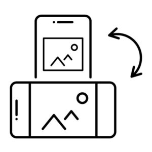
A website or application should not be restricted to a particular orientation but should adjust to the user’s preferred display orientation – whether viewed in portrait or landscape mode.
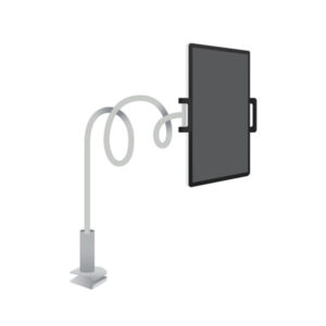
For example, those in wheelchairs or beds may only have a mounted device with access to a particular orientation.
Some exclusions apply, such as a piano app or check deposit feature in a banking app – here functionality in portrait would be almost impossible as checks are often wide and short, or mimicking a piano in portrait mode would mean losing the proper number of keys or the keys would be too thin/close together.
1.3.5 Identify Input Purpose (AA)
This indicates that user-specific input fields should use programmatically determined (HTML) inputs wherever possible. In other words, enable autocomplete.
This is of great help for those with cognitive and motor disabilities by minimizing the need to enter information through the use of autofill. It also improves the general user experience, as not everyone likes to type in their information already saved in the browser, like name, email, addresses, phone, birthday, etc. It also allows the browser or assistive technologies to present the information in alternative ways, such as an icon of a home for an input with autocomplete=“street-address.”
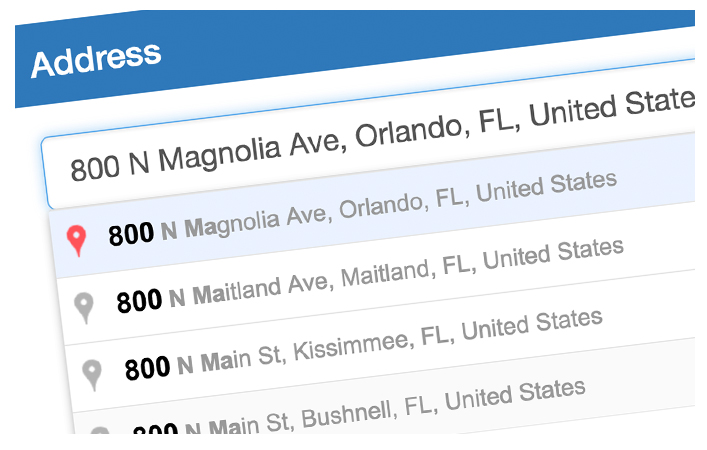
Image Source: Solodev
Common input type purposes are listed on the w3.org site. See Input Purposes for User Interface Components.
1.3.6 Identify Purpose (AAA)
This is a further standard that adds programmatic determination to the purpose of user interface components, icons, and regions. This is to aid those with various cognitive disabilities who are using filters that change words to symbols, navigate pages via keyboard shortcuts, etc.
It provides info about what the component represents, with HTML and sometimes ARIA markup – be careful here though, as no ARIA is better than bad ARIA.
For example, default landmark roles for HTML sectioning elements, such as <header>, <nav>, <main>, <footer> are used by assistive technology (AT) for keyboard navigation, as well as highlighting or hiding regions (i.e. a user can customize their AT to hide areas that do not have a role of main). Often HTML markup is sufficient, but it’s currently advisable to use both the HTML5 elements and the corresponding WAI-ARIA roles to increase compatibility.
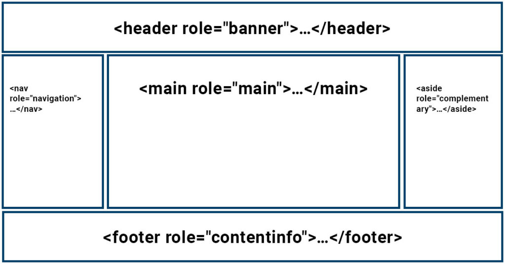
CODE SNIPPET: EXAMPLES IN HTML5
<header role="banner">…</header>

<main role="main">…</main>

<nav role="navigation">…</nav>

<aside role="complementary">…</aside>

<footer role="contentinfo">…</footer>
Code Source: w3org
Visit w3.org for some simple and more complex landmark examples.
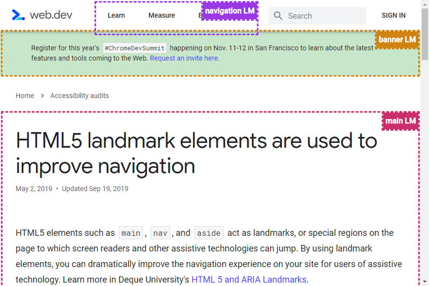
HTML5 elements such as main, nav, and aside act as landmarks, or special regions on the page to which screen readers and other assistive technologies can jump. By using landmark elements, you can dramatically improve the navigation experience on your site for users of assistive technology.
Quote and Image source: Webdev
1.4.10 Reflow (AA)
This sets limits for vertical scrolling to a width equivalent of 320 CSS pixels, and horizontal scrolling to a height equivalent of 256 CSS pixels. Why these pixels? Web content intended to scroll vertically should not have horizontal scroll at a minimum width of 320 CSS pixels (which equals 1280 CSS pixels at 400% zoom). Web content intended to scroll horizontally should not have vertical scroll at a minimum height of 256 CSS pixels (which equals 1024 CSS pixels at 400% zoom). 1280 is typically the smallest device width of a laptop or desktop monitor, and 320 is typically the smallest mobile device screen size.
There are exceptions to this rule where it is acceptable to provide two-dimensional scrolling for functionality and understanding, such as maps, diagrams, and data tables (not individual cells).
This rule is intended to help low vision/vision impaired individuals who use the browser zoom function to enlarge content without having to scroll in both directions or lose functionality or content by zooming. This also helps those on mobile devices, making it more user-friendly for all individuals.
Since the era of responsive design, this guideline shouldn’t be a deal-breaker as your responsive website content should already respond to various screen sizes; in other words, your content should reflow with CSS via media queries, flexbox, or other techniques.
The following example of our website zoomed in at 400% on the desktop shows the content in a similar manner as it would on a mobile device. Even at 400%, the webpage still scrolls in one direction (vertically) without loss of content or functionality.
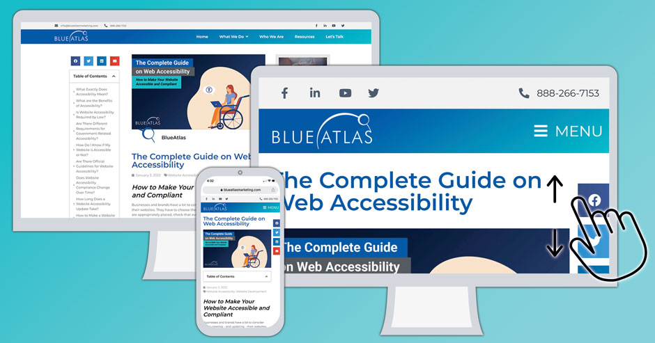
This guideline builds upon the Success Criterion 1.4.4 Resize text, which states text can be resized 200% without loss of content or functionality. So, if you meet the 1.4.11 criterion, you meet (and exceed) this criterion from WCAG 2.0. As we stated earlier, if you conform to 2.1, you are conforming to 2.0 as well.
1.4.11 Non-Text Contrast (AA)
User interface components and graphical objects (infographics, graphs, charts, icons) should have a contrast ratio of at least 3:1 against nearby colors. This helps users with vision issues, especially those with low contrast sensitivity who may have trouble making out objects if surrounding shades are too similar.
This includes states of user interface components. For example, a button or input’s focus or hover state should have sufficient contrast for those with low vision to distinguish from the default state.

Exceptions include logos, flags, real-life photos, or when sufficient contrast in the graphic changes its meaning – screenshots, medical diagrams, heat maps.
Icon Examples:
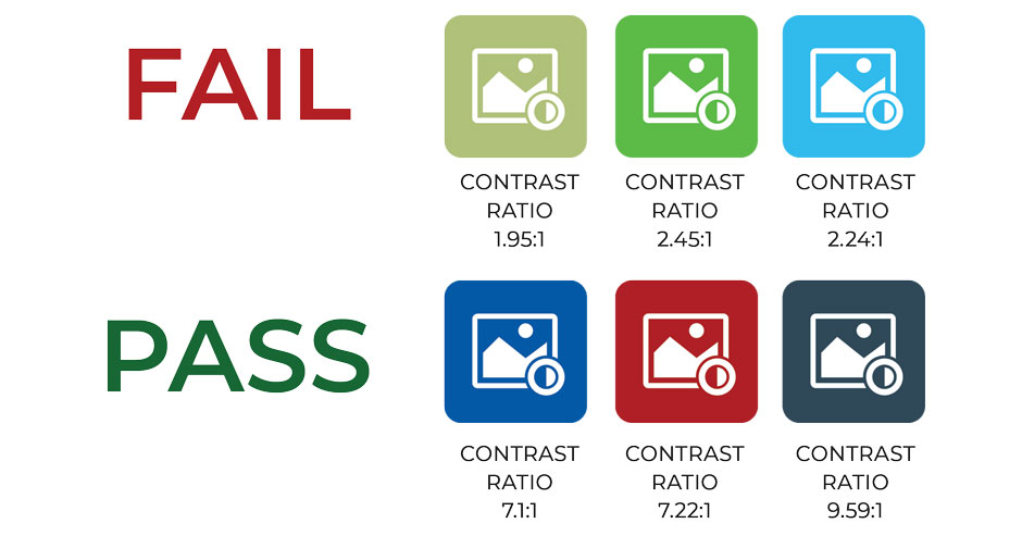
Pie Charts:
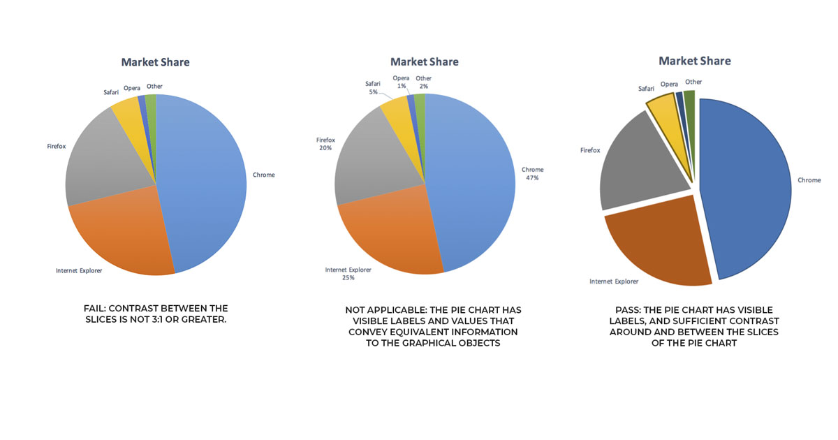
Image Source: w3org
In the above graphic, the first pie chart fails because the contrast between the slices is less than 3:1. Because the pie slides have no border between them, low-vision individuals might not be able to determine how much of the pie a particular color represents. The second chart is not applicable as supporting text (labels) explains the same data as the pie slices. In the third chart, the colors are darkened to contrast with the white background, and they are separated from each other. The yellow pie slice is given a darker border to further contrast from the background.
1.4.12 Text Spacing (AA)
This adds a requirement for markup languages to support the following user changes to the text styling:
- Line height (line spacing) to at least 1.5 times the font size
- Spacing the following paragraphs to at least 2 times the font size
- Letter spacing (tracking) to at least 0.12 times the font size
- Word spacing should be at least 0.16 times the font size.
This does not mean that the text property needs to be changed by the author (developer), but rather support increases by browser extensions or other client-side manipulations without the loss of content or functionality.
This helps those with dyslexia, low vision, or other cognitive disabilities. There are some exceptions where this isn’t as possible, such as PDFs, as they are not markup languages. Exceptions also include video captions embedding into video, images of text, and logos.
This is similar to the 1.4.10 Reflow criterion in that content should remain visible and readable when browser settings change the text styling. Content needs to reflow without overlapping or being cut off.
To adhere to this success criterion, your CSS should avoid declaring fixed containers (i.e., don’t set specific heights on containers, instead use min-height).
An example of a basic failure is NASA’s press release layout. When increasing the text spacing, the timestamp is no longer visible for some of the latest posts feed:
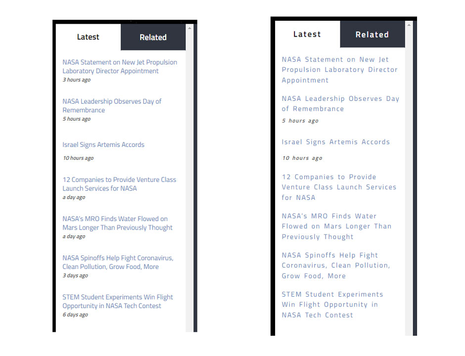
Testing tip: text spacing bookmarklet – Quick and dirty testing of WCAG 2.1 Success Criterion 1.4.12 Text Spacing.
1.4.13 Content on Hover or Focus (AA)
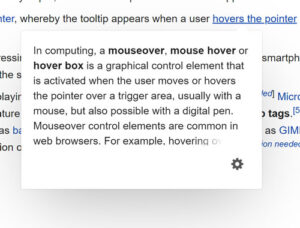
Additional content (tooltips, submenus) visible on pointer hover or keyboard focus should not interfere with existing content and be dismissible, hoverable, and persistent.
This additional content should be easy to manage – that means it should be readily dismissible (i.e., you can dismiss by pressing the ESC key and not have to move the mouse cursor or change focus). However, it also needs to support interaction with the cursor or keyboard (i.e., you can mouse over additional content, and the content doesn’t disappear when the cursor is moved).
It should also be persistent until the hovering/focus is ended, the content is no longer valid, or the user dismisses it.
2.1.4 Character Key Shortcuts (A)
Single-character keyboard shortcuts (shortcuts using only letters, punctuation, numbers, or symbols – any printable character) can be enabled on a site, but they should be easily turned off, remapped, or only active on focus. This is because some shortcuts can interfere with keyboard navigation, especially for speech input users.
Though single characters might seem efficient for normal keyboard users, applications and websites using single-character commands can be challenging to speech users.
For example, Gmail has several single-letter shortcuts, such as “r” to reply, “a” for reply all, and “f” for forward, but keyboard shortcuts can be easily disabled to provide a more operable application for speech users and for others in which single keyboard shortcuts cause difficulties.

2.2.6 Timeouts (AAA)
This criterion states that users should be warned about the duration before a timeout, or that data entered in web forms should be saved for at least 20 hours of inactivity so users can return without losing data. For security purposes or time-sensitive functionality (such as purchasing event tickets), it’s not realistic to save user data for >20 hours, so if this is the case the user must be notified of the time limit before proceeding.
For example, many banking sites expire a user’s session after so much inactivity for obvious security reasons. For this reason, a warning should be displayed at the beginning of a form/application that notifies the user of this session limit.
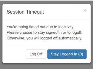
Image Source: jqueryscript
This criterion helps those with cognitive disorders who need more time or breaks to complete a task.
Note: Privacy regulations in some countries may require explicit user content, so be aware of your jurisdiction’s regulations.
2.3.3 Animation from Interactions (AAA)
Websites may use motion animation that’s triggered by a specific interaction. This type of non-essential animation should have an option to disable it whenever possible. For example, little animations that follow a mouse cursor as it moves can be very distracting for those with cognitive disabilities or possibly trigger a vestibular disorder reaction (including distraction, dizziness, headaches, and nausea).
An example of this type of animation is parallax scrolling, in which the background moves on the user’s scroll. While this has become a popular effect for websites, it can cause problems for those users who get dizzy or nauseated with this type of motion effect.
Sufficient techniques to pass this success criterion include using the CSS prefers-reduced-motion query to prevent motion, which is not supported by all browsers yet.
If using non-essential animation, you must allow users to disable unnecessary animations, such as a control at the top of the page.
2.5.1 Pointer Gestures (A)
Multipoint or path-based gestures (think some of the more complex trackpad controls, such as 2-fingered zoom) should have the option to be used with a single pointer/cursor on websites wherever possible. Some users with disabilities can’t use those gestures on a trackpad and need a way to operate important website tasks – such as cropping a photo with an online tool.

Single-point gestures include single tap, double tap, tap and hold
Some users find complex pointer gestures difficult or impossible (think someone that doesn’t have all 5 fingers), so providing an alternative means, which could be as simple as arrows for a sliding carousel, + and – icons for zooming on a map, provides ease-of-use for these users.
2.5.2 Pointer Cancellation (A)
This addition generally requires pointer activation to be very accurate when using a cursor. That includes the ability to cancel or reverse a function, and to make sure that a pointer doesn’t accidentally activate the wrong button through inaccuracy. This is to help those using pointers with vision or motor-related disabilities, as well as those using touchscreens. It also helps all users avoid annoying accidental selections by making sure the down-event of the pointer (mouse click) isn’t used solely to complete an action or function unless essential (essential example: a water gun game in which a touch event happens on the initial press – it wouldn’t make sense if the duck were not “hit” until lift of the finger/click).
The use of generic onclick events will meet this success criterion. For drag and drop functionality, authors should provide an undo or abort if dragged outside of the target area – watch this video of an aborted drag and drop.
2.5.3 Label in Name (A)
User interfaces must use accurate labels with text that always matches the text displayed on the interface. In other words, buttons should be programmatically tagged (i.e., alt text, aria-label, and aria-labelled by attributes) so it matches the button text. This helps screen readers and voice controls.
Users might be confused if the visible label doesn’t match what the screen reader reads aloud.
Watch this video of a speech user interacting with a failed button that doesn’t match its visual text label.
2.5.4 Motion Actuation (A)
When mobile devices encounter digital content that can be controlled by motion (i.e., tilting or shaking the device), this actuation should have the option to be disabled when possible unless it can be supported using assistive technology or is essential to its function – i.e.,, a step tracker.
Provide an alternative method to complete an action with conventional user interface components – i.e., a button or link.
This success criterion benefits those with mounted devices, which are usually in a fixed position. Those with tremors may accidentally trigger the motion-activated input and need to disable the motion actuation.
2.5.5 Target Size (AAA)

The target size for clicking with a pointer should be at least 44 by 44 CSS pixels. There are exceptions, like an inline text link or when the user agent controls the size.
The smaller the target – the harder it is to click on. It’s even more difficult on mobile devices. Use common user interface components and this shouldn’t be an issue. However, if you have clickable icons, you want to make sure these meet the size requirement of 44 x 44.
2.5.6 Concurrent Input Mechanisms (AAA)

Here, WCAG 2.1 says web content should not restrict the use of available input modalities – in other words, website operation should be compatible with keyboard, mouse, stylus, voice controls, etc., and switch between them seamlessly.
Don’t limit your web content functionality to touch-only on touchscreen devices. It should also be able to function with an external keyboard or mouse, even if on a mobile or tablet device.
4.1.3 Status Messages (AA)
Any status messages on a site should be programmatically determined to be presented to users with disabilities. This could be as simple as a one-liner noting that a web form has been successfully submitted.
Here, we’d use the role attribute to denote status, alert, progress, etc., to allow assistive technology like screen readers to announce new content to the user without shifting focus.
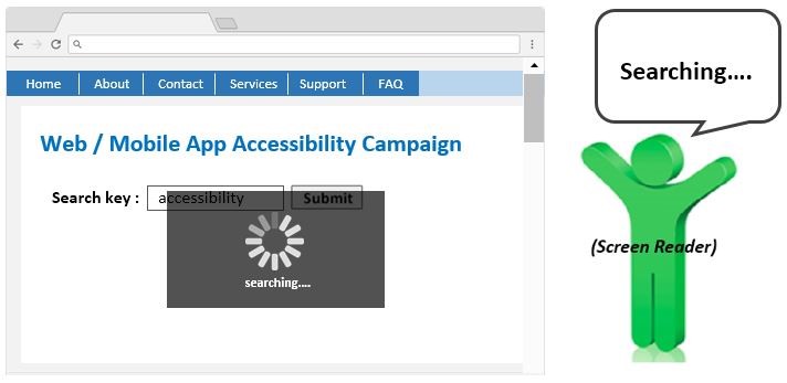
The role attribute already has ARIA specification associated with it. For example, a role of status has an implicit aria-live value of politeness, which will notify users of the message if they aren’t doing anything else. An aria-live value of assertive will immediately notify the user, which is also the equivalent of the role of alert.
This success criterion is an extension of 4.1.2 Name, Role, Value where developers use HTML to denote the name and role of user interface components.
These HTML elements help assistive technologies – screen readers, speech input, keyboard navigation, and more – but if used incorrectly, they can cause more problems and confusion to the user.
What’s Next for WCAG?
The World Wide Web Consortium (W3C) Web Accessibility Initiative (WAI) is currently working on WCAG 3.0 (W3C Accessibility Guidelines). WCAG 3 is not expected to be finalized for a few years. Before this version is released, WCAG 2.2 will be available (the official release date could be delayed, but the W3C website currently shows June 2022) with 9 new success criteria.
While it may seem like a lot to do for your website to be fully accessible, it’s all in the best interest to open the web for everyone, no matter their physical, cognitive, or learning disability.
Looking for More WCAG Help?
Blue Atlas Marketing’s experienced team can assist you with accessibility design decisions and new web development goals.
Talk to us about what you need and where accessibility is a priority: We can help diagnose issues and make changes that will make your site friendlier for everyone while meeting compliance requirements.


