Part 1: Web Accessibility Principles – Perceivable
To make a fully accessible and compliant website, developers turn to the WCAG, or the Web Content Accessibility Guidelines, currently on version 2.1. The WCAG 2.1 is created by the combined work of web experts around the world, and periodically updated to include new accessibility options for the latest technology. Since many different laws and regulations around the world (including the United States) reference the WCAG, it’s the go-to source for accessibility changes to make on your website.
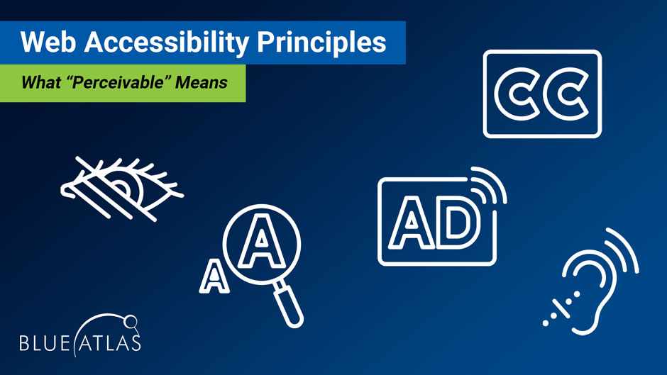
What “Perceivable” Means
Now it’s time to dig into some details. The WCAG 2.1 divides its guidelines into four primary pillars. We’re going over some details of the first pillar in this guide, “Perceivable.” What does Perceivable mean? It refers to how a website can be accessed by those with disabilities – these individuals should be able to perceive everything on a website they visit. That often means making content available in multiple ways.
That’s an overview of Perceivable, but if your brand is interested in making changes to your website for something like ADA (Americans with Disabilities Act) compliance, you’ll want plenty of specifics. The WCAG calls those specifics “success criteria,” and they contain plenty of details that developers can use. The problem is that they are a bit confusing, obscure, and frankly pretty boring.
We’re helping out with a condensed view of the success criterion for Perceivable, and what that translates to for your website. Let’s start with some of the most important changes you can make.
Perceivable Success Criteria
Text Alternatives
Does your website have non-text content? It should – images, videos, infographics, charts, and more are all key components in today’s websites, and important for good web traffic results. But those with visual impairments may not be able to perceive them: You need a text alternative so that these users can understand visual content. Let’s take a look at the most common examples and what they need.
- Images: A key part of images is their metadata, which includes the title of the image and its description. For web accessibility, the important field is “Alt Text” which should always be filled out (this is easier on some images than others). Alt Text should quickly describe what is in the image. It does not need to be a grammatically proper sentence and should save syllables where possible. The Alt Text is what screen readers will read out when describing an image, so think about what people should know about it and why the image is relevant. If it’s an instructional image, use the Alt Text to type out the specific instructions.
- Video: Video has two common options for text alternatives. The first is using captions, and there are a number of editing tools that you can use that can automatically add captions to video, or you can add these manually for more complicated content. The other option is a full text transcript of your video placed below it or provide a link to a separate page with the transcript. This option may be suitable for interviews, how-to video guides, and similar options. Transcripts may also help improve your SEO in some situations.
- Infographics: Infographics are used to share a lot of information in one cohesive image with charts and graphics. That’s a difficult thing to make accessible to those who may not be able to see the image. Tags like alt tags aren’t of much help here, there’s just too much data to communicate. One of the easiest ways to make infographics accessible is to provide a text-based alternative with all that data included.
- Charts: Interactive charts tend to use text, but they are worth mentioning because they can be tricky to make accessible. While screen readers and other technology can read chart information, they often do so incorrectly, in an order that doesn’t make sense. It’s a good idea to avoid interactive charts for accessibility reasons. A complex chart as an image should have short alt text denoting a full description that follows the graphic.
There are also unique situations for this criterion, certain content that requires more innovation. For these elements, experienced developers may be able to offer more advanced solutions that allow for the best of both worlds. This includes things like:
- Controls: Input controls should not be solely visible (i.e., a blank button). They should also have text and tag components that make it very clear what the input will do, such as an HTML <button> tag.
- Time-based media: This refers to media that has a durational dimension. This often requires expanded descriptions or identifying tags to make sure the information is perceivable.
- Tests: Some kinds of tests (like those involving recognition) don’t work well with text and will need more careful descriptive alternates.
- Sensory experiences: This refers to artistic content including visual art. In these cases, descriptions should focus on evoking the same experience that the art is intended to.
- CAPTCHAs: Like tests, CAPTCHAs don’t always work well with text descriptions. It’s good practice to include alternative ways to authenticate human users.
- Decorative Web Images: Make sure decorative elements (such as an image divider) will be ignored by assistive technology to prevent confusion. If purely decorative, it’s a good idea to avoid any tags that would be read by a screen reader, such as having empty alt text or including aria-hidden=”true”.
Audio and Video Alternatives
This is becoming a popular option in the form of podcasts and other types of audio files that play on websites. If a brand uses any of these, it should include an alternative that’s perceivable for those who may not be able to hear. Once again, transcripts are one of the best tools to fix this issue.
If a website livestreams content, it should include an add-on or player that allows users to enable captions, too.
This, of course, doesn’t apply to audio that’s designed to complement existing text. For example, if you provide an audio/video recording that is a summary or word-for-word of the text its accompanying, you don’t need to worry about on-site transcripts. In this instance, it’s a media alternative for the information that’s presented in text and would be read aloud by a screen reader already.
Adaptable Content
“Adaptable” means that website content should be perceivable across a variety of devices. Organizations should be very familiar with this type of compliance, because of mobile optimization: Brands already put plenty of work into making sure their websites can function for people using smartphones and tablets. In addition to this important general optimization, there are a few specific guidelines for accessibility to keep in mind.
- Text and website structure should make sense to screen readers: We talk more about screen readers in our other guides, but it’s important that websites work with this assistive technology. That means screen readers shouldn’t get confused or read out information in the wrong order. Clean, orderly website design makes a lot of difference here.
- Reference to elements should have multiple indicators: In other words, referring to links and buttons on a site should use more than one sense to describe the content. Instructions relying only on what a person might see, like color or location of a button need to be described by another attribute as well, such as its label – think about what a blind person might hear with a screen reader.
- Content should not be restricted by orientation: That means screen orientation – landscape or vertical – should not be an issue. If someone needs to use their tablet computer in a vertical orientation only, for example, the website should not cut off any text or render other content invisible.
- Input fields should be easy to autofill: If a website has user input fields, it should include tags clearly describing what it represents, which allows autofill tools to properly work and can save individuals with (and without) disabilities a lot of time. An example of this would be to use autocomplete=”name” within the input element so a browser’s autocomplete function would know that is represents a user’s Full name.
Distinguishable Content
Distinguishable means that website content needs to be easy to see or hear without other elements getting in the way. Important criteria for this include:
- Color should have good contrast: Colors with low contrast can be difficult to see, especially if the text color is similar to the background color. WCAG Level AA requires a contrast ratio of at least 4.5:1 for standard text. Contrast also applies to any other interface components or graphics needed to understand content.
- Autoplay audio limitations: If audio autoplays on a website (not a great idea) for longer than three seconds, it needs to have a mechanism to stop it or turn off the volume.
- Text spacing: Line height and letter spacing should allow for increases (by browser extensions or other client-side manipulations) made to it and remain visible and legible.
- Text resizing: Text should be able to be resized up to 200% for those who have trouble reading small text.
- Hover or focus content should be user-friendly: If a site has key content that appears when a pointer/cursor is over it, it should be persistent (remaining visible until the pointer is removed) and dismissible (there’s a way to remove it even if the pointer isn’t removed).
Compliance Levels
If you look at the text of the WCAG 2.1, you’ll see that each success criteria is accompanied with a subhead of “Level A”, “Level AA”, or “Level AAA.” That indicates the level of compliance from lightest to most stringent. For organizations in the United States that want to avoid lawsuits or fines, Level AA compliance is highly suggested for their websites. Level A compliance is nice for overall web design but not really enough to meet accessibility standards. Level AAA is typically reserved for sites where maximum accessibility for everyone is needed, like sites provided by the federal government.
In this guide, we covered important Level A and AA criteria, and left Level AAA largely untouched, as it applies to only some specific sites. However, if your organization is working with the federal government, you may want to check if any parts of your site or web content need to meet Level AAA compliance.
Final Notes
Make sure to take a look at our other success criterion guides for other WCAG pillars like Operable and Understandable. The good news is that the Perceivable pillar typically has the most demands when it comes to updating modern websites, so after successfully completing items in that section, your site is already on its way to being very accessible.
Looking for Help with Your Website’s Accessibility?
To learn more about accessibility or arrange a meeting to talk about your accessibility needs, contact Blue Atlas Marketing. Our team of developers has plenty of experience with accessibility upgrades and can help you find a plan to meet your goals.


