How Web Design Impacts Content Marketing

Understanding how web design impacts content marketing is crucial to your digital marketing strategy. Your website’s design plays a vital role in shaping visitors’ first impressions of your brand.
A clean, intuitive layout attracts your target audience and supports your content in engaging ways. When design and content align, they create a seamless experience that keeps visitors engaged.
Without a good web design, even the best content can get lost.
This article will explore how web design enhances your content marketing efforts and drives business success.
Key Takeaways:
Designing a Content-Friendly Site

A content-friendly site isn’t just about great copy—it’s about weaving the right design elements together to guide and engage users seamlessly.
Let’s look at two crucial areas that can make or break the impact of your content: navigational layout and mobile responsiveness.
First, a well-structured layout and navigation ensures that users can intuitively explore your content.
Good navigation combines links, menus, and buttons in a natural way, helping visitors find what they need without frustration.
The layout’s role is to visually organize your page, directing attention to key elements and enhancing the overall usability.
A poorly structured site? It’s one of the biggest reasons users abandon a page, with 34% leaving due to unclear navigation.
Equally important is mobile optimization. With over 55% of internet users accessing sites via mobile (compared to desktop at 41% [the rest going to tablets]), ensuring your design is responsive across devices is critical.
If your site doesn’t adapt well to smaller screens, you risk losing half your audience before they even engage with your content.
A responsive design improves user experience and boosts your chances of keeping visitors engaged longer.
Readability and Comprehension
The right design choices can make content visually appealing and effortlessly readable.
Let’s explore two design fundamentals that significantly enhance user comprehension: typography and visual hierarchy:
Best Practices for Typography and Font Choices
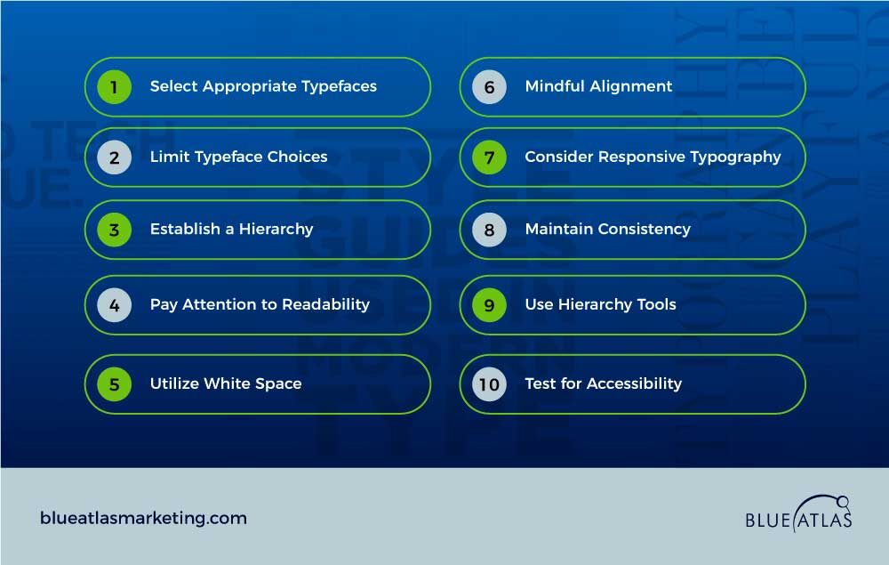
Typography plays a huge role in readability. Here are some essential practices:
Visual Hierarchy Affecting Reader Engagement
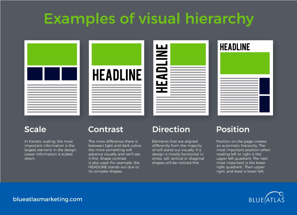
Effective visual hierarchy can be the difference between content that captivates and content that confuses.
By simply structuring elements logically and prominently, designers guide users toward desired actions—like signing up or reading more.
Elements like headers, menus, and call-to-action buttons should flow naturally, creating a path that easily leads users from one piece of information to the next.
User Experience and Engagement
A well-designed website isn’t just about looking good; it’s about keeping visitors engaged. Why? Let’s dig deeper:
Seamless Navigation in Retaining Visitors
Navigation is a critical element of user experience.
When navigation is cluttered or overly complex, users quickly become frustrated and leave.
Clean, intuitive navigation ensures visitors can easily locate what they need without unnecessary clicks or confusion.
Clear labels and thoughtfully placed menus create a smoother experience, significantly boosting users’ chances to stay longer and engage with more content.
Website with Exception User Experience
Some of the world’s most successful websites prioritize user experience by blending excellent design with functional elements.
Here’s a look at what makes them stand out:
| Websites | Feature | Web Design Element |
| Apple | Streamlined product browsing | Minimalistic navigation |
| Spotify | Personalized recommendations | User-friendly interface |
| Dropbox | Easy file sharing | Clean, responsive layout |
| Slack | Simplified communication tools | Seamless integration and design |
| AirBNB | Visual search results | Bold imagery and typography |
| Medium | Smooth reading experience | Clear text hierarchy |
| Adobe | Creative tool accessibility | Intuitive menu design |
| Duolingo | Gamified language learning | Interactive design |
| Canva | Drag-and-drop features | Simple, intuitive controls |
| Notion | Flexible workspace | Clean and functional structure |
Have you accessed and experienced their websites? What can you say?
Brand Consistency Through Design
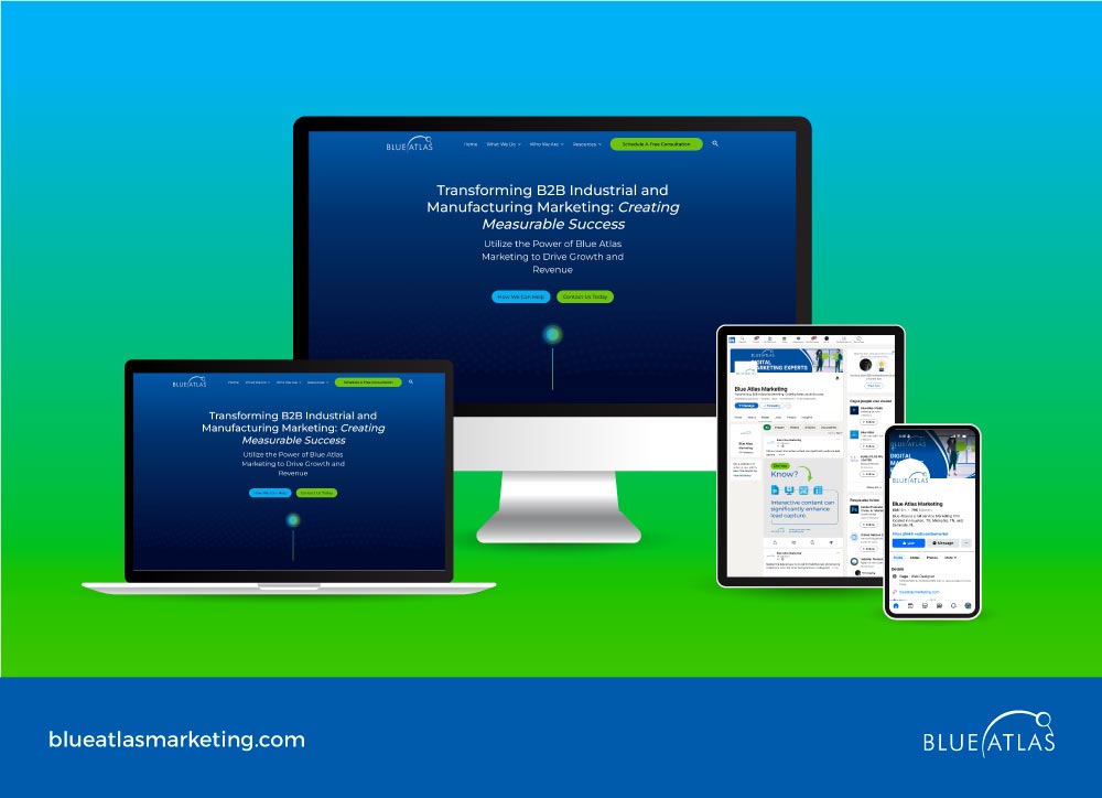
Consistent design is key to reinforcing brand recognition and building trust.
A website that aligns with your brand’s visual identity not only looks professional but also leaves a lasting impression on visitors.
Brand consistency involves maintaining uniformity across all platforms—your website, social media, packaging, and more.
When your brand’s colors, typography, and overall style are cohesive, customers can easily recognize and remember your brand.
This visual harmony encourages customer loyalty, helping to turn one-time visitors into repeat customers.
It also strengthens word-of-mouth marketing as users begin to associate specific visual elements with your brand.
Moreover, a strong brand message needs to be visually reinforced.
Design elements like color schemes, fonts, and imagery should reflect your brand’s personality and goals.
For example, vibrant colors may suggest energy and creativity, while muted tones might communicate professionalism and calm.
Aligning these visual choices with your messaging ensures that your brand identity comes across clearly and resonates with the right audience.
Accessibility in Web Design
Creating an accessible website isn’t just about meeting standards; it’s about making sure everyone can connect with your content.
Accessibility is crucial for reaching a broader audience and ensuring that no visitor is excluded from engaging with your brand.
Making Content Accessible to All Users
When online content is accessible, it’s inclusive, allowing everyone to engage, regardless of ability or demographic profile fully.
Accessible design benefits society by enabling more people to participate, contribute ideas, and share perspectives.
It’s not just a social responsibility but a strategic choice that builds goodwill and extends your reach to a more diverse audience, including those with disabilities, older adults, and users with varying technological access.
Techniques for Improving Accessibility
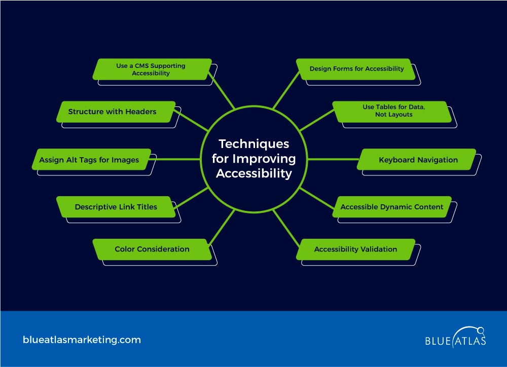
Making a site accessible involves specific tools and practices that enhance usability for all:
- Use a CMS Supporting Accessibility – content management systems (CMS) like WordPress and Drupal offer plugins and features geared toward accessible design;
- Structure with Headers – organize content with clear headers, allowing screen readers to navigate the page easily, essential for visually impaired users
- Assign Alt Tags for Images – descriptive alt tags make images understandable for screen readers. For instance, instead of “Image123.jpg,” a meaningful tag like “woman holding smartphone” adds context,
- Descriptive Link Titles – replace “click here” with specific text, such as “download report,” helping users understand link purpose,
- Color Consideration – ensure color contrast meets accessibility standards (e.g., WCAG guidelines), which are critical for color-blind users,
- Design Forms for Accessibility – include clear labels and instructions; Adobe and Google Forms excel here,
- Use Tables for Data, Not Layouts – tables should clarify data, not control page layout,
- Keyboard Navigation – ensure users can fully navigate without a mouse, crucial for people with motor impairments,
- Accessible Dynamic Content – use ARIA labels for dynamic elements, like pop-ups, to ensure assistive technology compatibility.
- Accessibility Validation – tools like WAVE or Axe can test and validate site accessibility.
Visual Storytelling and Brand Personality

Visual elements can be powerful tools to bring your brand to life, making content more engaging and memorable.
As Tess Flanders famously said, “A picture is worth a thousand words.”
In content marketing, this holds especially true—images, videos, and infographics add depth, making complex ideas easier to understand and more appealing.
High-quality visuals catch the eye, break up text, and encourage users to interact with your content.
Videos can humanize your brand, while infographics make data more digestible. Together, they form a compelling toolkit to enhance message retention and drive engagement.
To craft a narrative that truly resonates, begin by understanding your brand’s core message.
Ask yourself: What do you want users to feel, understand, and remember?
Use this foundation to build a story consistently reflecting your brand values across all content.
Incorporate visual storytelling using imagery, symbols, or colors that reinforce your message, like vibrant hues for youthful brands or calming tones for a professional image.
Consistency is key—when every element speaks the same language, your audience becomes more connected with your brand.
Measure the narrative’s impact by observing engagement and feedback, ensuring that your visuals continuously align with audience expectations.
Optimizing for Conversion and Sales
A well-designed website can guide users toward taking action and converting visitors into customers.
Let’s explore two key factors in achieving this: effective CTA placement and the psychology of design that influences user behavior.
Strategic placement of CTAs (Calls-to-Action) Within Web Design
Calls-to-action, or CTAs, are most effective when strategically placed where users naturally pause or engage with content.
Studies, such as those conducted by Nielsen Norman Group, reveal that users often focus on areas like the end of a blog post, below product descriptions, or in sections with visually engaging elements.
Placing CTAs in these high-traffic zones increases the likelihood of interaction, as visitors are prompted to act when they’re most engaged.
The goal is to place CTAs where they feel like a natural next step rather than a disruptive pop-up.
Psychology of Designs that Influences Action
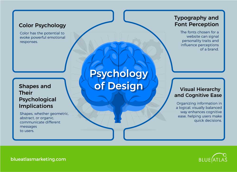
The psychology behind design choices plays a surprisingly powerful role in shaping user behavior, a concept extensively explored according to Printivity.
Design elements—such as color, typography, and shapes—trigger specific cognitive and emotional responses, ultimately influencing a user’s perception and willingness to act.
Here’s how these psychological principles can be applied to enhance conversions:
Color Psychology
- Color has the potential to evoke powerful emotional responses.
- Warm colors like red and orange, often used for “buy” or “subscribe” buttons, evoke urgency and action, while cooler tones like blue are associated with trust and stability.
- Leveraging these associations enables designers to tap into desired reactions—like excitement for time-sensitive offers or reassurance for financial services.
- Research from Cambridge Design Science states that colors guide user expectations and influence decision-making processes based on inherent emotional triggers.
Typography and Font Perception
- The fonts chosen for a website can signal personality traits and influence perceptions of a brand.
- In research conducted by the Software Usability Research Laboratory at Wichita State University, participants viewed traditional fonts (e.g., Arial, Times New Roman) as stable and mature, while more casual fonts (e.g., Comic Sans) conveyed friendliness and youthfulness.
- These associations highlight how subtle choices in typography affect user perception, potentially aligning with or detracting from brand personality.
- An authoritative brand, for example, might benefit from more traditional fonts, while a lifestyle blog might achieve higher engagement with playful or modern typography.
Shapes and Their Psychological Implications
- Shapes, whether geometric, abstract, or organic, communicate different messages to users.
- Geometric shapes like squares and triangles, commonly seen in corporate designs, convey stability and order.
- Abstract shapes, such as arrows or stars, are linked to cultural symbols and trigger clear associations; arrows, for instance, indicate movement or progression.
- Organic shapes—natural forms like leaves or waves—are used in wellness and eco-brands to suggest relaxation and harmony.
- According to studies from ResearchGate (2019), these shapes influence user interpretation at a subconscious level, shaping their experience and overall connection to the brand.
Visual Hierarchy and Cognitive Ease
- Organizing information in a logical, visually balanced way enhances cognitive ease, helping users make quick decisions.
- Visual hierarchy, established through layout, font sizes, and color contrast, ensures that users’ eyes are naturally drawn to key elements like headlines or CTAs.
- When users encounter a well-structured design, they find it easier to process information, which reduces decision fatigue and encourages action.
- It is safe to conclude that visual hierarchy in design positively impacts user engagement by improving cognitive load management and reducing distractions.
Technical Performance and SEO Benefits
A well-designed website isn’t just about aesthetics; its technical performance can directly impact both user experience and SEO rankings.
Speed is crucial in today’s fast-paced digital world.
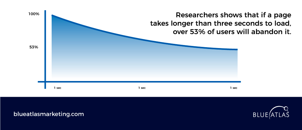
Research shows that if a page takes longer than three seconds to load, over 53% of users will abandon it.
A slow site not only frustrates visitors but also impacts search rankings, as search engines deprioritize sites with poor loading speeds.
Optimizing load times through efficient coding, image compression, and responsive design is essential for retaining users and maximizing content reach.
When a site performs well, users are more likely to stay and engage, boosting its visibility and credibility.
Moreover, Web design and SEO work in tandem to create a seamless, high-ranking site.
While design focuses on visual appeal and user interface, SEO aims to make content relevant and discoverable for search engines.
Effective web design incorporates responsive layouts, clean navigation, and optimized content structures—all of which improve user experience and help search engines understand site relevance.
Without SEO, even the best-designed sites may struggle to rank, underscoring the need for both aspects in any digital strategy.
Ensuring Findability Through SEO-Friendly Design
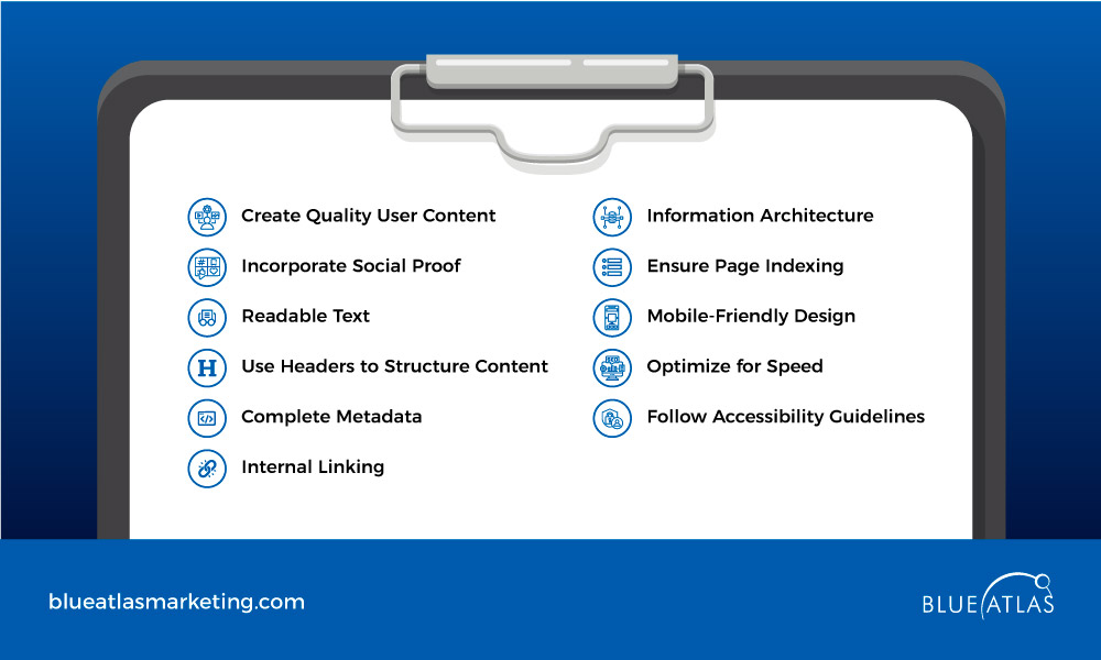
Designing for SEO is essential to ensure that your content is discoverable and accessible.
Here are some best practices to make your web design SEO-friendly:
- Create Quality User Content – prioritize content that provides value to users.
- Incorporate Social Proof – integrate reviews, testimonials, and case studies.
- Readable Text – use fonts and layouts that enhance readability.
- Use Headers to Structure Content – organize information with clear, hierarchical headers.
- Complete Metadata – optimize each page’s titles, descriptions, and alt tags.
- Internal Linking – guide users with strategic links within the site.
- Information Architecture – design a logical, intuitive layout for easy navigation.
- Ensure Page Indexing – enable search engines to crawl and index pages effectively.
- Mobile-Friendly Design – adapt layouts for seamless mobile access.
- Optimize for Speed – minimize load times for better performance.
- Follow Accessibility Guidelines – make content accessible to all users.
A website that effectively blends strategic design with content marketing essentials drives real results—capturing attention, engaging visitors, and converting them into loyal customers.
Understanding how web design impacts content marketing is crucial for creating a site that not only looks great but functions seamlessly across various devices.
A poorly designed website can hinder engagement, while a well-designed site offers a seamless user experience supporting your brand’s message. By incorporating elements like accessibility, SEO, and content marketing, you improve both content visibility and the overall success of your digital presence.
Frequently Asked Questions (FAQs)
What are the key elements of web design that enhance content marketing?
Key elements like intuitive navigation, clean layout, and mobile optimization play a significant role in improving user experience. These factors make content more accessible, which is essential for engaging your audience and driving conversions.
Why is accessibility important in web design for content marketing?
Accessible design ensures all users, including those with disabilities, can engage with your content. This inclusivity expands your reach and improves user interaction, creating a better experience for visitors on various screen sizes and devices.
How does brand consistency in web design impact content marketing?
Consistent use of design elements, such as color schemes and typography, reinforces your brand identity. This creates a cohesive, memorable experience for visitors, building trust and loyalty, which helps drive long-term engagement with your content.
What role does SEO play in web design related to content marketing?
SEO-friendly web design helps optimize content for search engines, improving your website’s ranking. This boosts visibility, attracts more traffic, and enhances the effectiveness of your content strategy, ultimately leading to increased audience engagement.
Why Blue Atlas Marketing?
Ready to transform your web page into a high-performing digital asset? At Blue Atlas, our web designers specialize in redesigning websites to create a positive experience that aligns design, performance, and content strategy.
Whether you’re redesigning or building a new site, we stay on top of the latest design trends to help you build a successful online presence.
Contact Blue Atlas Marketing today to discuss how we can elevate your brand and amplify your content marketing efforts!


