The Best B2B Website Design Examples That Convert

Not all websites are created equal. In B2B website design, some stand out by attracting site visitors, driving conversions, and boosting brand awareness, while others fall flat with cluttered layouts and confusing navigation. A great design isn’t just about looks—it’s about creating an experience that turns visitors into loyal customers.
But how can you ensure your site outshines the competition?
In this article, we explore top-performing websites that deliver results and highlight the features that make them successful. Keep reading to find out more.
Key Takeaways:
Best B2B Website Design Examples
Below are examples of B2B websites that excel in both form and function.
These websites captivate visitors visually and drive conversions through their thoughtful, user-centric designs.
To get the whole experience of each design, visit their respective sites to explore their homepage and overall structure:
Hubspot
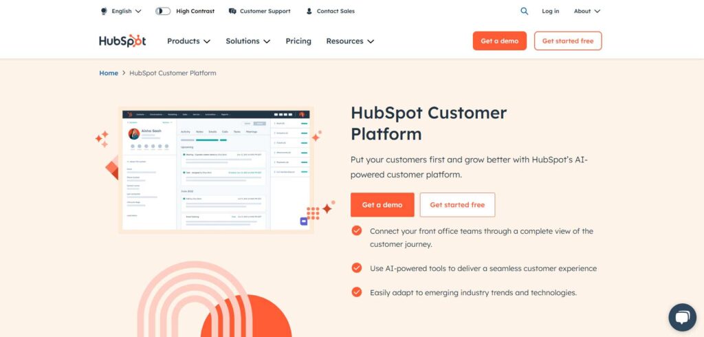
HubSpot’s website is the epitome of clean, scalable design. With its vibrant color palette, HubSpot seamlessly integrates visuals with informative content.
Their intuitive navigation and prominent CTAs guide users effortlessly through various services. HubSpot is responsive across all devices. It ensures a consistent user experience from desktop to mobile.
Shopify
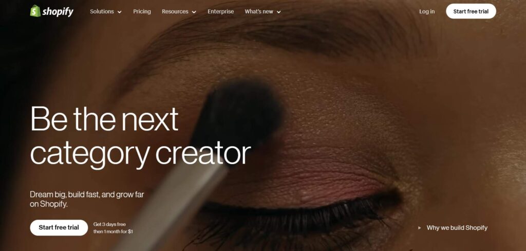
Shopify’s website shines with its minimalist design, emphasizing product images and clear CTAs. The site’s layout uses white space effectively, making navigation simple and engaging.
Shopify excels in guiding users to take action, with product features highlighted prominently. The overall design remains focused on conversions.
Asana
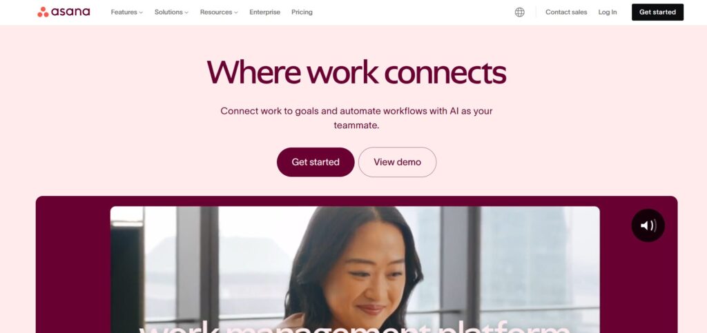
Asana’s design focuses on simplicity and functionality, with bright pink-purple colors and soft gradients that draw users’ attention to important elements.
Their clean UI emphasizes teamwork and project management, ensuring ease of navigation. Asana’s design speaks directly to productivity while maintaining an approachable tone.
IBM
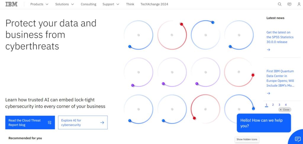
IBM’s website merges cutting-edge design with corporate professionalism.With light, bold colors, and sleek typography, the design conveys authority.
Their homepage is information-rich but balanced with visuals that enhance the content rather than overwhelm it.
Adobe
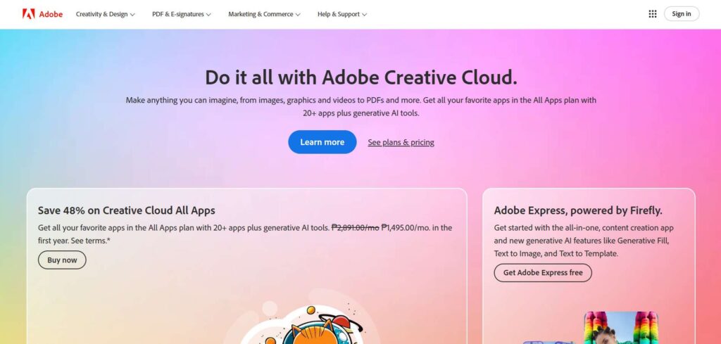
Adobe’s website design is all about visual creativity, reflecting the brand’s design-focused audience. It uses bold colors, interactive elements, and high-resolution imagery to keep users engaged.
The streamlined layout is easy to navigate, with seamless transitions between products and services.
Zendesk
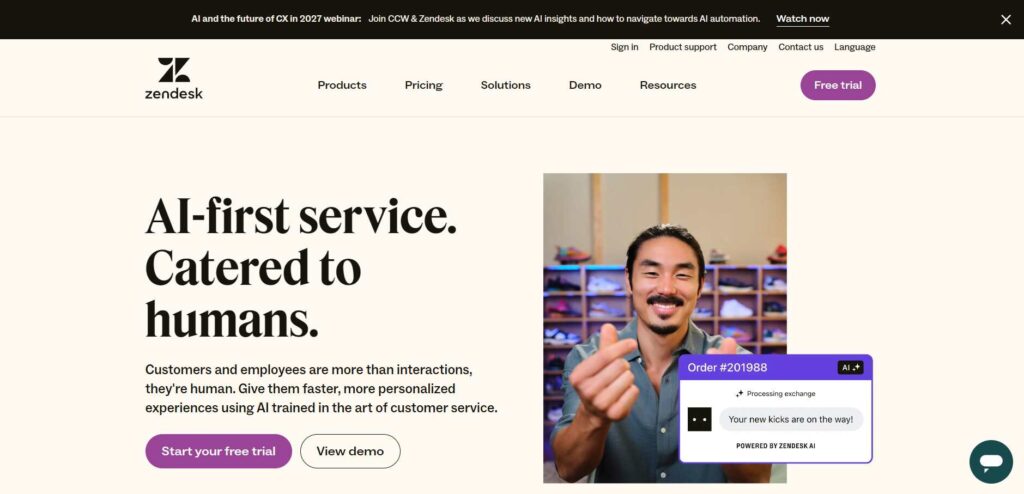
Zendesk’s website design puts the user first. With its calm color palette and simple layout, the design evokes a sense of clarity and trust.
CTAs are strategically placed to encourage users to explore their product offerings. The user journey is smooth, creating a sense of ease.
Salesforce
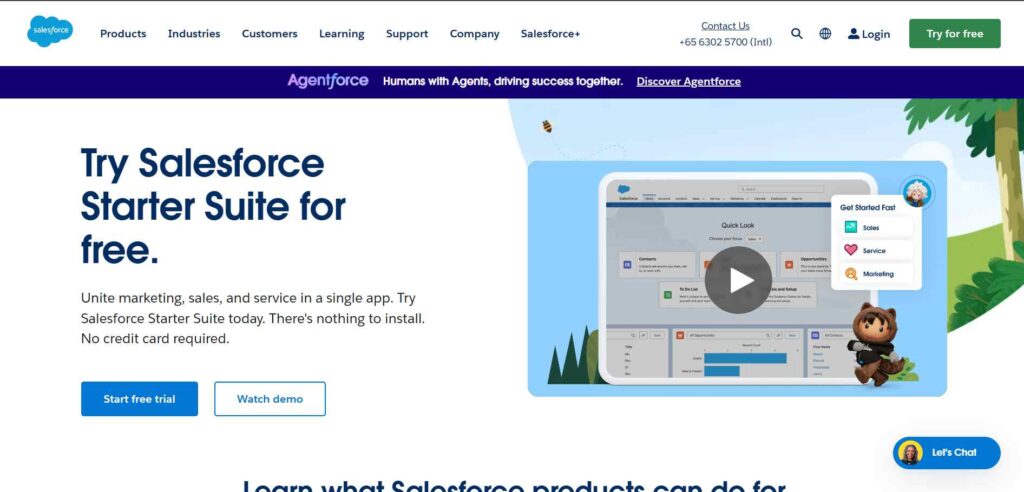
Salesforce blends visually dynamic elements with a user-friendly layout. The site’s bright colors and engaging imagery create a welcoming experience.
CTAs are placed strategically, while the navigation ensures users can find the solutions they need without hassle.
Monday.com
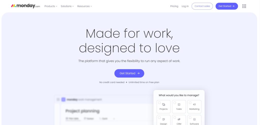
Monday.com’s vibrant and visually engaging site captures attention with its bold, colorful interface.
The design emphasizes simplicity, allowing users to understand the platform’s benefits quickly. The playful yet professional look enhances user experience, leading to higher engagement rates.
Dropbox
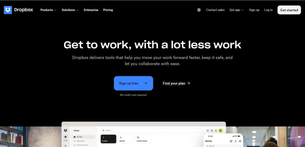
Dropbox uses a minimalist design with a focus on clean typography and bold imagery.
The homepage features subtle animations that guide the user’s attention without being distracting. Clear CTAs and a smooth user journey ensure that users can easily access Dropbox’s services.
Mailchimp
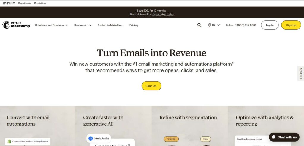
Mailchimp’s quirky and creative website reflects its brand personality while ensuring a strong user experience.
The use of bright colors and bold illustrations makes the design memorable. CTAs are clear, and navigation is intuitive, helping visitors find exactly what they need.
Square
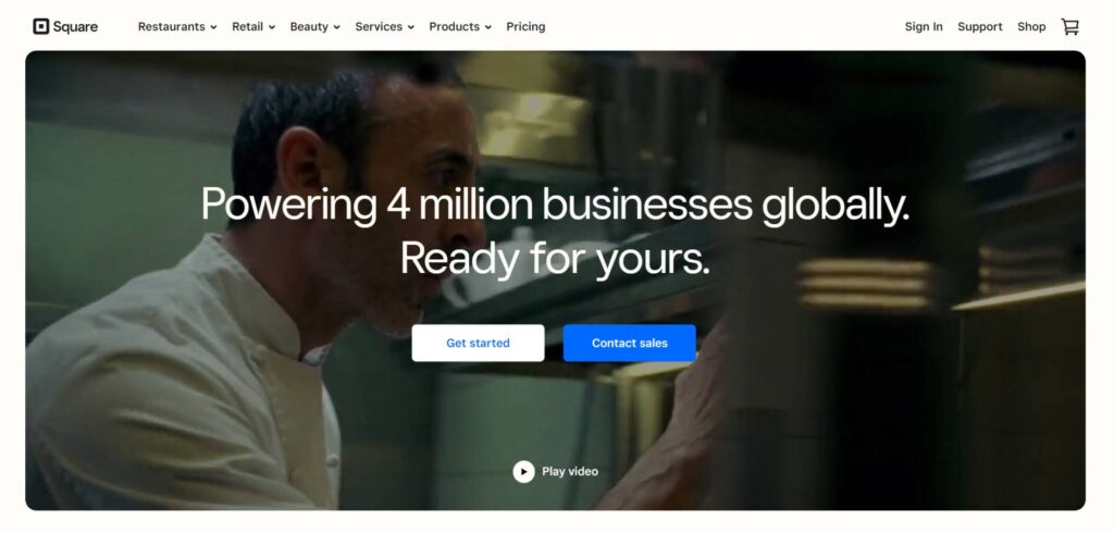
Square’s sleek and professional design is characterized by sharp lines and a modern aesthetic.
The site maintains a clean, uncluttered look, effectively using white space and strong typography. CTAs are well-placed to guide users through the sales funnel via the basket icon.
Intercom
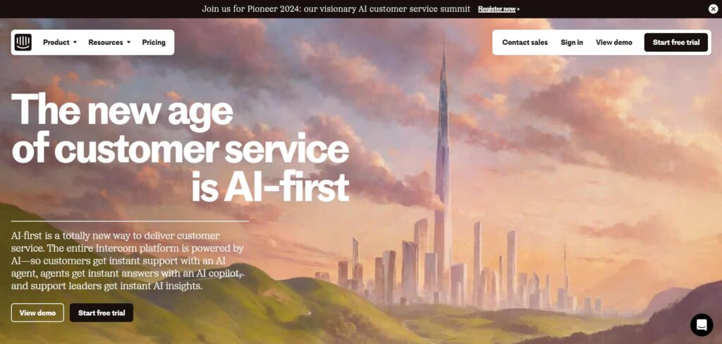
Intercom’s design focuses on communication, featuring a balance of bold, colorful illustrations and concise, actionable text.
The website is easy to navigate, with each section flowing naturally into the next. Strong CTAs and a responsive design make for an optimal user experience and try the free trial.
Gainsight
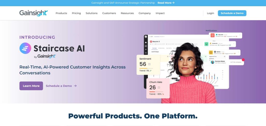
Gainsight’s website is built around creating an easy, personalized experience for users.
The design combines professional visuals with clean, structured navigation. Key CTA, schedule a demo, is placed strategically to drive user engagement, and the website layout is optimized for conversions.
Pipedrive
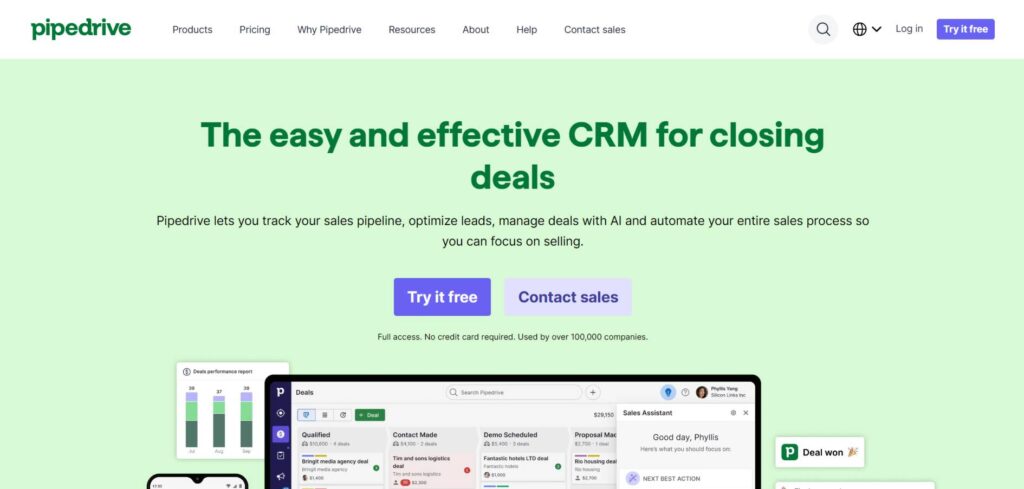
Pipedrive’s design revolves around simplicity and functionality, making it easy for users to navigate its CRM features.
The homepage highlights key selling points with large, bold text and clear CTAs that guide visitors to learn more or sign up. The clean, modern layout, combined with a minimalist color palette, keeps the user’s focus on the essential information.
Every element is thoughtfully placed to minimize distraction and enhance conversions. The site is mobile-responsive, ensuring a smooth experience across devices.
NetSuite
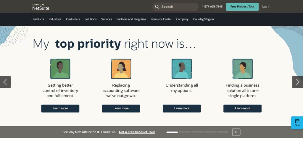
NetSuite’s website design exudes professionalism, with a sleek, corporate aesthetic that mirrors the complexity of its enterprise solutions.
The homepage balances text-heavy content with well-placed visuals and CTAs that prompt users to dive deeper into their cloud-based products.
The navigation is intuitive, ensuring potential customers can easily find what they’re looking for. NetSuite’s design reinforces trust using authoritative colors and clean typography.
Capterra
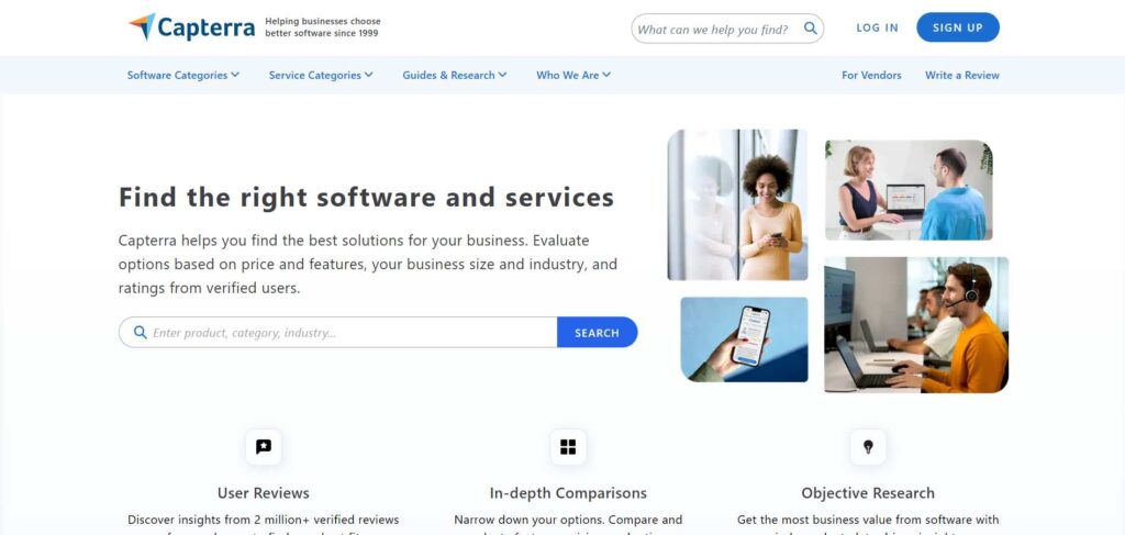
Capterra’s homepage is built for quick, effective decision-making, featuring a well-organized layout that helps users easily find product reviews and software recommendations.
The clean design focuses on functionality with a simple, easy-to-use interface. The prominent search bar and categorized lists help users quickly access the most relevant content.
This design promotes conversion by removing barriers to finding the right solution.
Cobalt AI
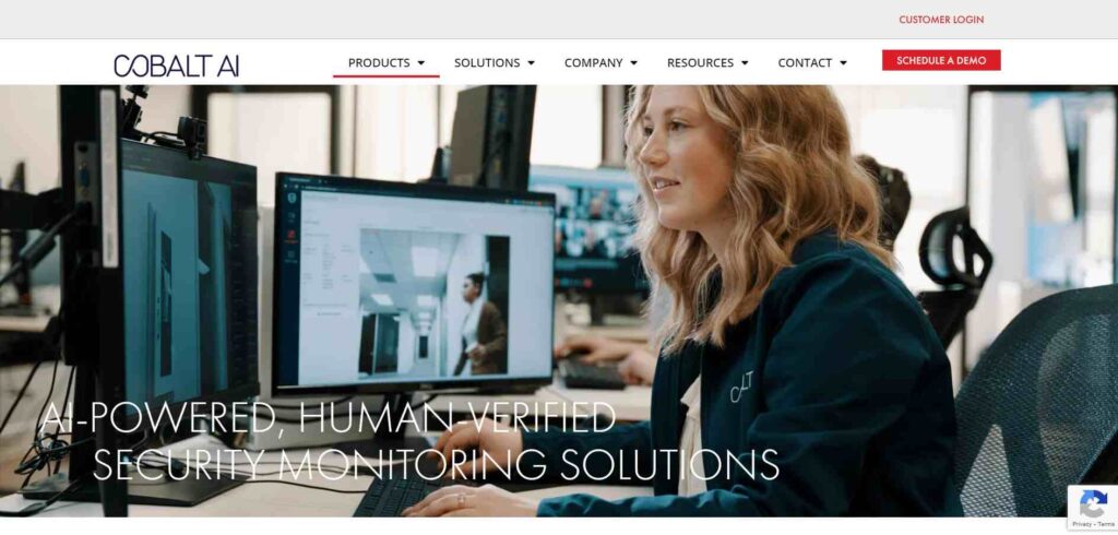
Cobalt AI’s design captures attention with its sleek and modern interface, showcasing its cutting-edge AI solutions.
The clean homepage features a minimalist color scheme that allows the content to shine.
Each section is structured to guide users through the platform’s offerings, with strategically placed CTAs that drive engagement. The design speaks directly to tech-savvy users while remaining accessible and professional.
Looker Studio

Looker Studio’s website design highlights its analytical tools with a combination of bold visuals and sleek typography.
The homepage is structured to showcase data-driven insights clearly and engagingly, while the minimalistic design keeps users focused on the critical content.
CTAs are strategically placed, and the user experience is seamless across devices. Looker Studio effectively communicates its value through a professional and straightforward design.
Splunk
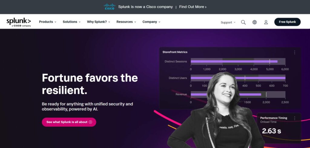
Splunk’s website design is a masterclass in balancing data-heavy content with a clean, accessible layout.
The homepage features bold imagery and straightforward messaging, allowing users to grasp the platform’s benefits quickly.
CTAs are clear and placed in a way that encourages further exploration without overwhelming the visitor. The design promotes efficiency and professionalism, appealing to data-driven decision-makers.
Elastic
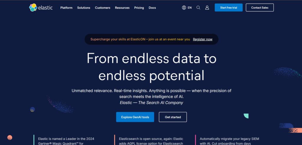
Elastic’s website merges bold design with functionality, creating an engaging user experience that speaks to tech-savvy audiences.
The homepage uses a vibrant and darker color scheme and concise messaging to communicate the platform’s capabilities.
Clear CTAs guide visitors to relevant product information, making it easy to navigate the vast offerings. Elastic’s design is modern and approachable, focusing on delivering key information quickly.
Airtable
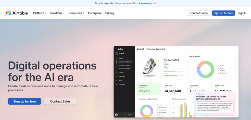
Airtable’s website design stands out for its vibrant color palette and user-friendly layout.
The homepage uses bright visuals, clear metrics, and clear messaging to explain the platform’s features, making complex tasks like database management feel simple and accessible.
Airtable’s design is centered on usability, with intuitive navigation and prominent CTAs guiding users to critical areas of the site. The design’s overall feel is energetic and creative, perfect for a diverse audience.
Domo
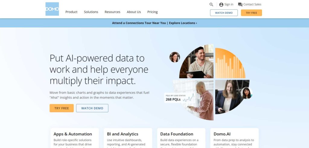
Domo’s website design is sleek and professional, with a strong focus on data visualization.
The homepage features striking graphics that convey the platform’s capabilities in business intelligence, while the minimalistic layout ensures that users aren’t overwhelmed by information.
Strategic CTAs and seamless navigation create a user-friendly experience that encourages further exploration. Domo’s design is optimized for conversions, and its target audience is clearly understood.
PagerDuty
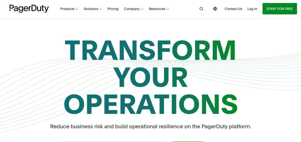
PagerDuty’s website is clean and straightforward, offering a professional design that immediately communicates reliability and efficiency.
The homepage features large CTAs that encourage users to explore their platform, while the well-structured layout makes it easy to understand PagerDuty’s offerings at a glance.
The design is also responsive, ensuring optimal experience on all devices. The simplicity of the design doesn’t sacrifice depth, making it both user-friendly and informative.
Freshworks
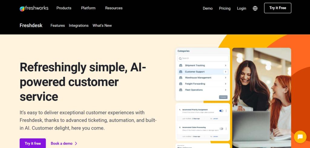
Freshworks’ design is bright and welcoming, using a playful color scheme that reflects the brand’s commitment to providing user-friendly software solutions.
The homepage combines strong visuals with clear, actionable CTAs, creating a design that is both engaging and easy to navigate. The overall layout is well-organized, guiding users to explore the product’s features without feeling overwhelmed.
Freshworks excels at balancing a fun aesthetic with a professional tone.
Slack
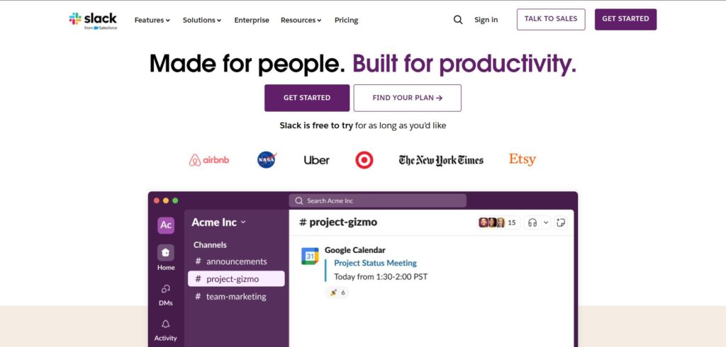
Slack’s website design is sleek, modern, and focused on simplicity. The homepage uses large visuals and clear messaging to communicate Slack’s value proposition, while intuitive navigation ensures users can quickly find what they need.
Slack’s signature playful design elements, such as its bright colors and friendly illustrations, make the site approachable without compromising professionalism. CTAs are clear and strategically placed throughout the site.
Kaltura
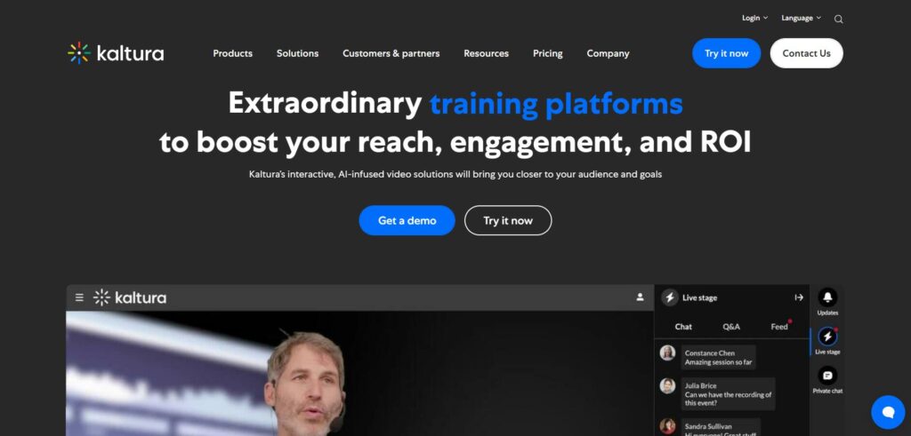
Kaltura’s website design reflects its focus on video solutions, with a clean, modern layout that straightforwardly showcases its offerings.
The homepage uses bold imagery and concise text to highlight key features, while well-placed CTAs encourage users to explore further.
The design is responsive, ensuring a consistent experience across devices. Kaltura’s site is both professional and engaging, creating a smooth user journey from start to finish.
Zoho
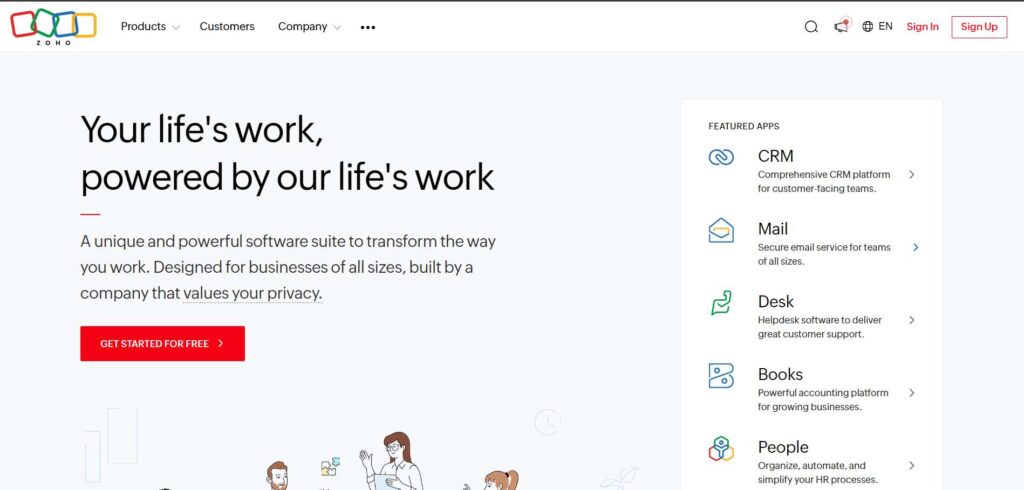
Zoho’s website emphasizes simplicity and functionality with a minimalistic design that ensures users can quickly find the information they need.
The homepage features a clean layout with clear CTAs and concise text highlighting Zoho’s extensive tool suite.
The design’s use of white space keeps the focus on the content, making it easy to navigate without distractions. Zoho’s design is practical and efficient, catering to many business users.
Trello
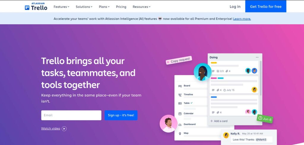
Trello’s website design is vibrant and engaging, with a colorful, playful aesthetic that aligns with the collaborative nature of the platform.
The homepage is user-friendly, featuring bold visuals and simple CTAs that guide visitors through Trello’s key features.
The design promotes ease of use, making it simple for users to understand the platform’s value at a glance. Trello’s overall design is energetic, making it approachable to a broad audience.
Fundamental Design Principles for Effective B2B Websites
Effective website design goes beyond aesthetics.
It’s about understanding the user’s needs and providing an intuitive, seamless experience that fosters trust and drives conversions.
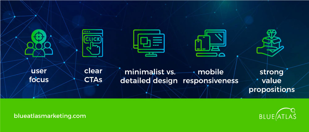
Customer-Centric Design
Creating a B2B website hinges on prioritizing the customer at its essence. User-focused design emphasizes enhancing user experience (UX), ensuring intuitive navigation for visitors.
This approach involves delving into the needs and aspirations of your target audience to develop a website that caters to them effectively.
Noteworthy platforms, like Amazon and Netflix, stand out for tailoring the user experience through personalized content derived from user data.
A strategy that fosters a sense of empathy and assistance among customers.
In the business-to-business context of websites, design philosophy goes beyond appearance; it encompasses accessibility and usability well.
Ensuring accessibility means making the website user-friendly for individuals with various abilities so everyone can easily interact with the content.
Simple tweaks like using fonts and straightforward navigation with contrasting colors can significantly enhance user experience.
To explore instances of customer-focused design excellence in action, look at renowned brands, like Starbucks and Zappos, that consistently prioritize developing easy-to-use online platforms.
Effective Use of Call-to-Action (CTAs)
A powerful CTA can make or break your website’s ability to convert visitors into leads or customers.
Best practices for CTAs in B2B website design include being clear, concise, and actionable.
Each CTA should guide users toward a specific action, whether signing up for a newsletter, requesting a demo, or downloading a whitepaper.
Successful B2B websites incorporate multiple CTAs throughout the site, strategically placed at high-traffic points like the homepage, product pages, or blog sections.
Examples include phrases like “Get a Quote,” “Download Now,” or “Start Your Free Trial,” all of which prompt the user to take immediate action.
Moreover, creating a sense of urgency, such as limited-time offers or exclusive deals, can drive conversions more effectively.
You enhance the website’s performance by aligning CTAs with the overall user journey and ensuring they resonate with your audience’s goals.
Minimalist Design vs. Detailed Design
Minimalist design has gained popularity for its ability to present information clearly without overwhelming users.
B2B websites benefit from minimalist design by offering a cleaner, faster-loading experience that reduces distractions and helps users focus on key content.
Brands like Apple and Google have mastered this approach by using ample white space, simple color schemes, and limited elements to create a seamless browsing experience.
On the other hand, detailed design can also be effective in B2B contexts, especially for industries where users require more in-depth information to make decisions.
For example, tech companies or financial services often use detailed layouts that provide comprehensive product features or industry insights.
Adding complexity helps build trust by offering clarity and transparency in these cases.
Knowing when to use a minimalist approach versus a more detailed design depends on your industry, audience, and goals.
Both styles can work if they are balanced with ease of use.
Responsive Design
According to Exploding Topics, responsive design is no longer optional, with over 60% of global internet traffic from mobile devices and 92.3% of internet users accessing the internet using a mobile phone.
Every website must function seamlessly across devices, whether desktop, tablet, or mobile.
A responsive website adapts to different screen sizes, ensuring users have an optimal experience no matter their device.
Mobile optimization is vital to keeping users engaged. Slow load times, broken layouts, or difficult navigation on mobile devices can quickly lead to high bounce rates.
Ensuring that the website is mobile-friendly doesn’t just improve user experience—it’s also a crucial factor in SEO.
Search engines like Google prioritize mobile-optimized sites, which means a responsive design can boost your rankings and visibility online.
Companies like Slack and Dropbox have embraced responsive design, ensuring their services are accessible and usable on any device.
Clear Value
A strong value proposition communicates to visitors why they should choose your services over competitors.
It’s essential to clearly articulate this message on the homepage to capture the user’s attention immediately.
Elements like concise headlines, compelling visuals, and strong CTAs all work together to reinforce the value you offer.
An effective value proposition explains what you do, how you solve your customers’ problems, and why your solution is unique.
For instance, companies like Salesforce and HubSpot convey value by showcasing how their solutions can increase business efficiency and drive growth.
Using visual elements such as icons, videos, or testimonials can further strengthen your message, making it more relatable and impactful to your audience.
Ensure that your value proposition is easy to understand and backed by specific benefits that resonate with your target market.
Trends in B2B Website Design
B2B website design is constantly evolving, and staying ahead of trends can significantly improve user experience and engagement.
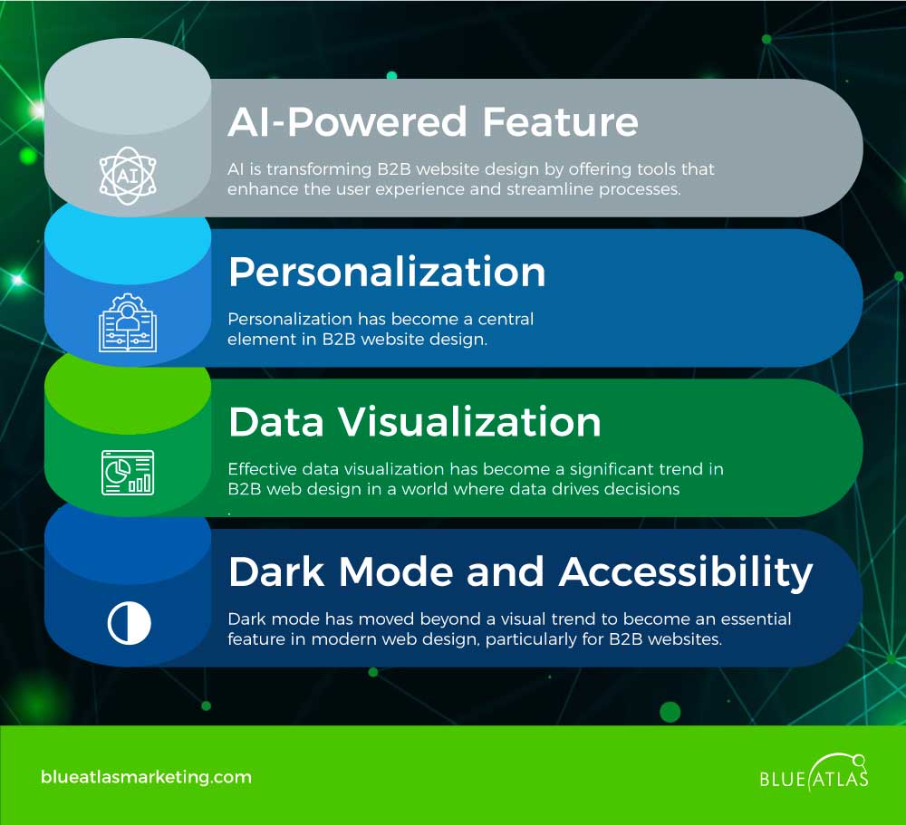
AI-Powered Feature
AI is transforming web design by offering tools that enhance the user experience and streamline processes.
Below are some key ways AI is being used to improve B2B websites:
Personalization
Personalization has become a central element in B2B web design.
Businesses can use AI and machine learning to create customized experiences for each visitor based on their browsing history, preferences, and past interactions.
Personalized content increases engagement and builds a deeper connection with the user, improving trust and loyalty.
For instance, a website can dynamically adjust its content to show relevant case studies or product recommendations depending on the user’s industry or previous interactions.
This level of personalization can turn casual visitors into qualified leads by presenting them with highly relevant information tailored to their needs.
Data Visualization
Effective data visualization has become a significant trend in B2B web design in a world where data drives decisions.
Data visualization uses graphical representations like charts, graphs, and infographics to simplify complex information, helping users understand patterns and insights more quickly.
For B2B websites, this is especially valuable as it enables users to grasp product performance, market trends, or detailed analytics at a glance.
Good data visualization improves understanding and helps persuade potential clients, making complex data accessible and actionable.
When incorporated effectively, these elements can transform a website from just informative to an interactive experience that enhances decision-making process.
Dark Mode and Accessibility
Dark mode has moved beyond a visual trend to become an essential feature in modern web design, particularly for B2B websites.
Offering a sleek, professional look, dark mode is also more accessible on the eyes, especially for users who spend long hours on screens.
Wix have shown that dark mode can increase user engagement, with platforms like Meta reporting a 15% increase in time spent on-site when dark mode is enabled.
In addition, accessibility is a growing priority in website design, ensuring that websites are usable by people with disabilities.
Features like keyboard navigation, screen reader compatibility, and high-contrast designs make websites more inclusive, expanding their reach to a broader audience.
Best Practices for Designing B2B Websites
A successful B2B website must do more than just look good; it needs to be optimized for performance, search visibility, and content that resonates with its audience.
SEO Best Practices
Search engine optimization (SEO) is crucial for driving organic traffic to your website.
To ensure your site ranks well on search engines, you need a solid strategy tailored to the unique needs of your audiences.
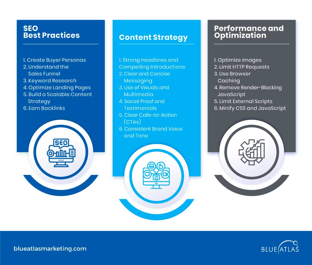
Key SEO strategies include:
- Create Buyer Personas – understanding your audience is the foundation of any SEO strategy. Develop detailed buyer personas to tailor your website’s content and keywords to their needs and pain points.
- Understand the Sales Funnel – B2B customers often have longer decision-making processes. Your website should cater to each sales funnel stage with targeted content that nurtures leads.
- Keyword Research – Conduct in-depth keyword research focused on your personas. Identify terms and phrases relevant to your industry that potential customers are searching for at different funnel stages.
- Optimize Landing Pages – product and service landing pages should be optimized for relevant keywords, featuring clear messaging, engaging content, and strong CTAs.
- Build a Scalable Content Strategy – consistently producing high-quality, optimized content, such as blog posts, case studies, and whitepapers, helps increase visibility and authority.
- Earn Backlinks – promoting your content through guest posts or industry partnerships can help earn valuable backlinks, boosting your site’s authority and search rankings.
Content Strategy
An effective content strategy is vital for turning website visitors into customers.
B2B websites require content that informs, builds trust, and drives conversions.
Critical elements of a high-converting content strategy include:
Performance and Optimization
Website performance directly impacts user experience and search rankings.
Slow loading times or inefficient website performance can lead to high bounce rates and lost business opportunities.
Here are some essential techniques for optimizing your website’s performance:
- Optimize Images – large image files can significantly slow down a website. Compress images and use formats that load quickly without sacrificing quality.
- Limit HTTP Requests – reduce the number of HTTP requests made by your site to improve loading speeds. This can be achieved by combining CSS and JavaScript files.
- Use Browser Caching – enable browser caching to store frequently used data on the user’s device, speeding up load times for repeat visitors.
- Remove Render-Blocking JavaScript – ensure that JavaScript is non-blocking so important content can load first, improving perceived performance.
- Limit External Scripts – keep the use of external scripts, such as tracking codes or third-party widgets, to a minimum to avoid slowing down your website.
- Minify CSS and JavaScript – remove unnecessary characters, comments, and spaces in your CSS and JavaScript files to reduce file size and improve load speed.
Frequently Asked Questions (FAQs)
What are the essential elements of a successful B2B website design?
Key elements include user-centric design, clear CTAs, mobile responsiveness, SEO optimization, and a strong value proposition.
How can AI improve B2B website design?
AI enhances user engagement, personalizes content, streamlines navigation, and provides data-driven insights for better decision-making.
What are the best practices for optimizing B2B websites for conversions?
To guide users through the sales funnel, focus on clear messaging, effective CTAs, fast loading times, and personalized content.
How does responsive design impact user experience?
Responsive design ensures your site works seamlessly across all devices, improving accessibility, user satisfaction, and search engine rankings.
A well-executed B2B website design is more than just a digital storefront—it’s a powerful tool that can drive conversions and elevate your brand’s presence.
By blending modern design with a seamless overall user experience, you can ensure your site not only attracts visitors but also turns them into loyal customers.
Whether you’re inspired by top website examples or creating something entirely unique, the key is to prioritize functionality and user satisfaction. When done right, your website becomes a cornerstone of business success.
Ready to take your B2B Website to another level?
Blue Atlas Marketing offers tailored web design services to meet your business needs. Whether it’s enhancing your user interface or a complete redesign, we’re here to help.
Schedule your free consultation today and let’s boost your digital marketing success together!