10 B2B Website Design Trends That are Driving Conversions

Your B2B website design plays a large role in how site visitors respond to your content and call to actions. Brush up on the latest design trends that are appealing to target audiences and driving interest and conversions.
We have a question for you: How do you increase your conversion rate by up to 200%? Now, here’s the short answer: With a well-designed website interface.
We’re betting you already knew we were going to tell you a well-designed user experience on your website could increase your conversions, but we were pleasantly shocked by the growth rate a solid design can bring. In this article, we’re going to show you 10 trends designed to help you on the path to a higher conversion rate.
Keep reading to learn everything you can do to make your B2B website design more powerful.
B2B Website Design
The best B2B websites are the ones which convert. It’s great to educate leads and build brand awareness with stellar content, especially if that leads to a conversion, but at the end of the day, the website is only worth the business it brings in. Check out our blog on How to Write Killer CTA’s for Your B2B Website to find out even more!
We’ve already shown you how large a part of the design of your website plays in your conversion rate. Now we’ll show you which design elements you need to maximize your conversion potential.
1. Get Secure
A secure website sends the message that you care about your visitors. You want to protect their data.
If you’re still using “http” instead of “https”, you’re not providing ample enough security. These days, visitors will notice because your URL won’t have the lock symbol next to it.
Worse still, some browsers, like Google Chrome, are now warning users away from insecure websites. Because of this, clinging to your “http” can hurt your search engine optimization (SEO).
Therefore, not only can your incoming traffic begin to slump, but with distrust between you and your clients, your conversion rates could suffer.
2. Get Responsive
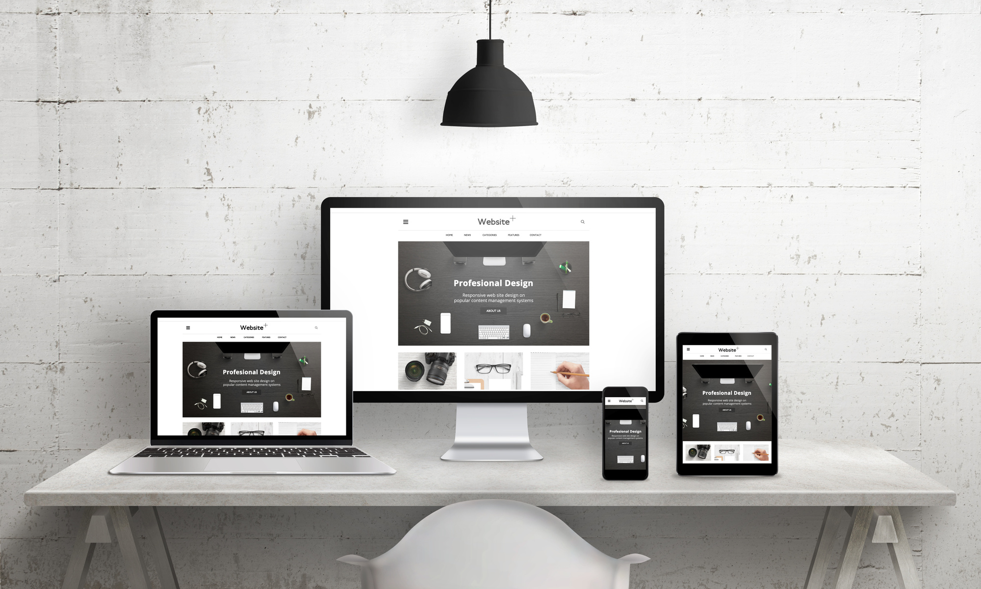
At first, responsive design for mobile was more important in a B2C environment. Nowadays though, everyone browses on the go.
B2B website design must include a mobile-friendly, responsive website. No one–especially your clients–wants to waste valuable time scrolling side to side and pinch-zooming all the time.
3. Get Streamlined
Single-page websites are all the rage for B2B conversions because of several reasons. Not only are they easier to build and keep up, but they’re mobile-friendly.
Additionally, they’re great for domain authority because backlinks will all point to the same URL. More domain authority means more trust, and more trust means more conversions.
4. Get Negative…Space
Negative space not only looks more modern and clean, but it places more importance on the content it surrounds. The best B2B websites use negative space wisely.
5. Get Sticky Navigation
Even if you’re using a single-page website design, you can still use navigation. But don’t let your potential clients leave your navigation in the dust as they scroll down your page–especially if it contains call-to-action (CTA) links.
All B2B sites should have a sticky or fixed navigation to improve the user experience and drive conversions. Imagine your Contact Us link hovering beside or above all your content.
6. Get Moving
A hero image is a vibrant and professional-quality image that stretches the whole width of the screen. A background video can do the same, and so much more.
The benefits of including video in your website are long-established. But imagine if, instead of a background hero image, your page began with a background video showcasing your service or product.
Background videos can drive engagement, which in turn can lead to conversions. If they show your product or service in action, then the client can move along the buyer journey with even more expediency and certainty.
7. Get Pretty
Years ago, there were only a handful of available web fonts. A web font is a font which is viewable by all browsers, operating systems, and devices.
Nowadays, there are so many web fonts available thanks to free font libraries like Google Fonts that there’s no excuse not to have exciting fonts that encompass your brand’s personality.
8. Get Artsy
Line art is minimalistic and clean looking. The benefit to such a design to your B2B website is you can incorporate visuals without overpowering the messaging.
This allows visitors to your site to focus on how you can solve their pain points, which brings them closer to conversion. Meanwhile, the visual quality of the line art will hold their engagement while that conversion takes place.
9. Get Fast
Even a one-second delay in page loading time can lead to a 7% lower conversion rate. Page speed may not seem like a design element because it’s not something visual like a font or button, but your web design informs, to a large degree, your page load time.
You should aim to have your website load in two seconds or less for desktop, three seconds or less for mobile. If your page takes too long to load, visitors may abandon it.
You can’t convert people on your website if they never actually visit your website.
10. Get Conversions…
Conversions are what this article is all about, and we’ve saved what we think is the best for last. One of the latest trends in website design for conversions is the full-screen form.
These high-impact forms are simple to use. Because the form takes up the whole screen, users are more likely to convert.
Such a large form also sends the message that it’s important. So not only is it all users can see in that navigational moment, but they inherently understand filling out the form to be the most important thing they can do on your site.
Final Thoughts
B2B website design involves so many considerations, but first and foremost should be your goal to achieve a high conversion rate. Getting visitors to convert to leads, and then getting those leads to convert to customers, is the most important task your website can complete.
Hopefully, these design elements will help your website fulfill this purpose.
Take a look at our website development services and let us know if you still have questions about how to redesign your website to increase conversions!
We’d love to help your B2B website realize its maximum potential by improving conversions, your bottom line, and your return on investment.


